
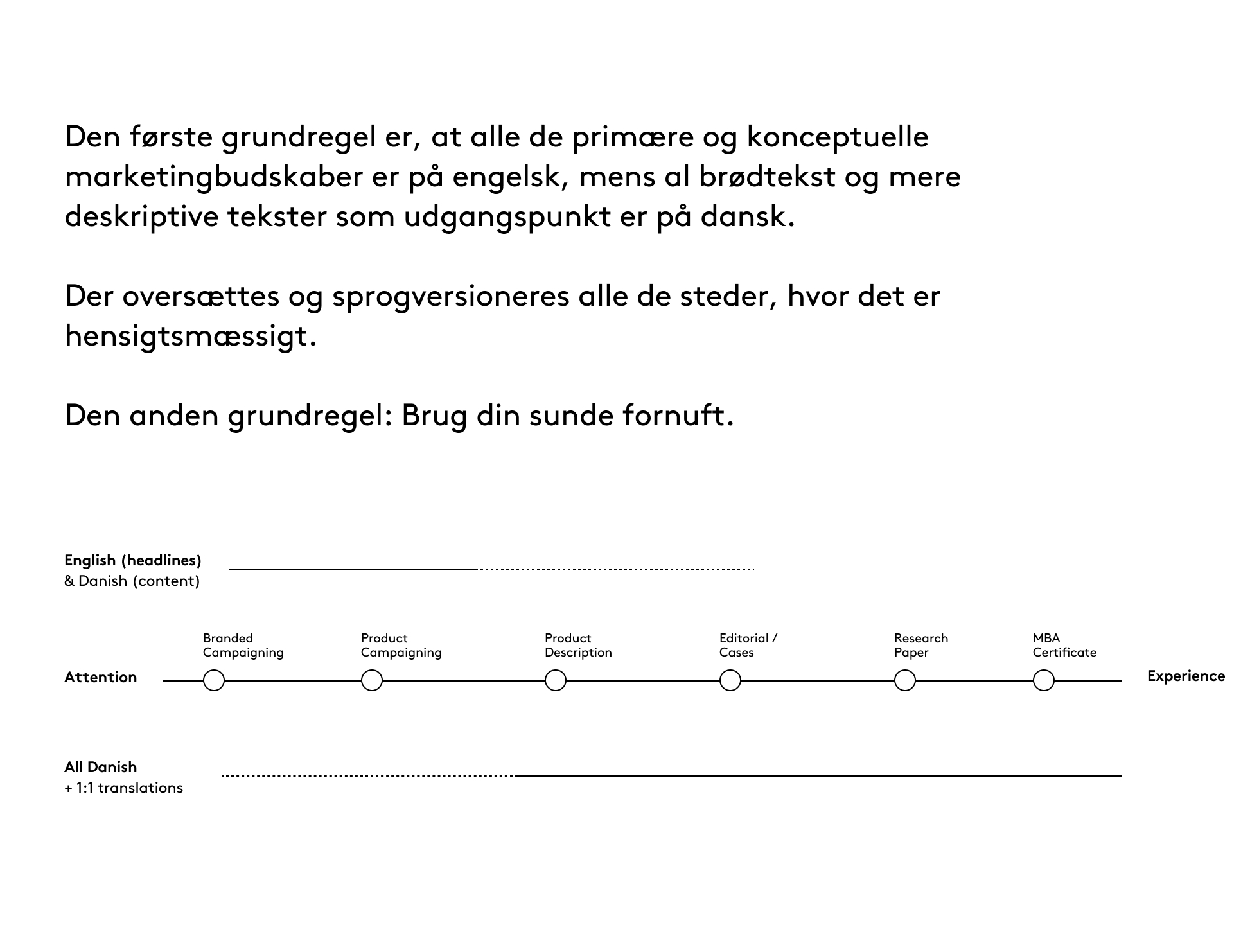
01
01
02

03

04

05
06
07

08

09
10

11
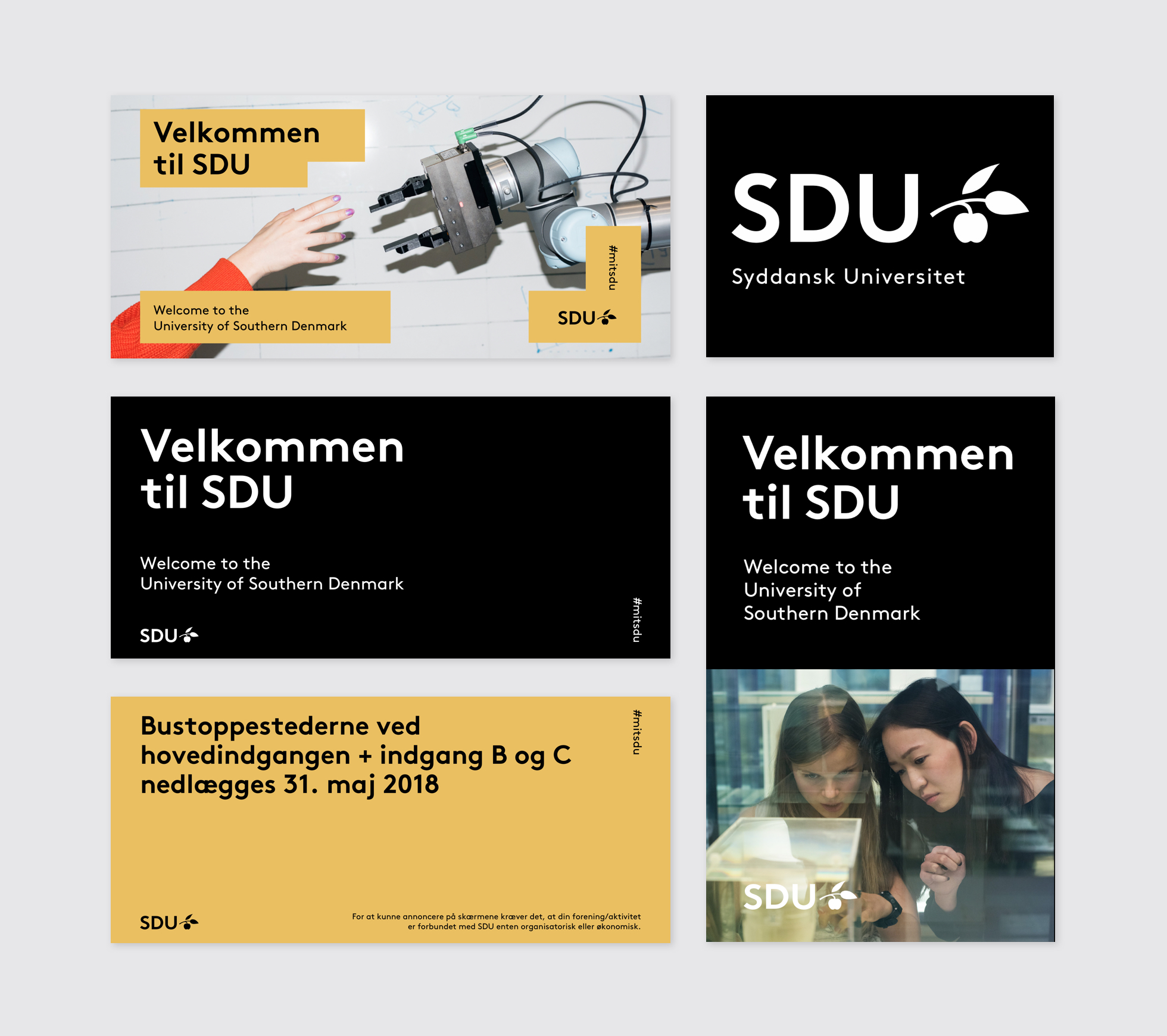
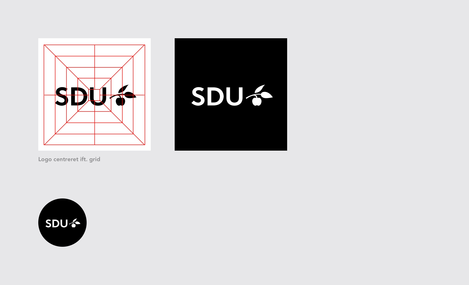
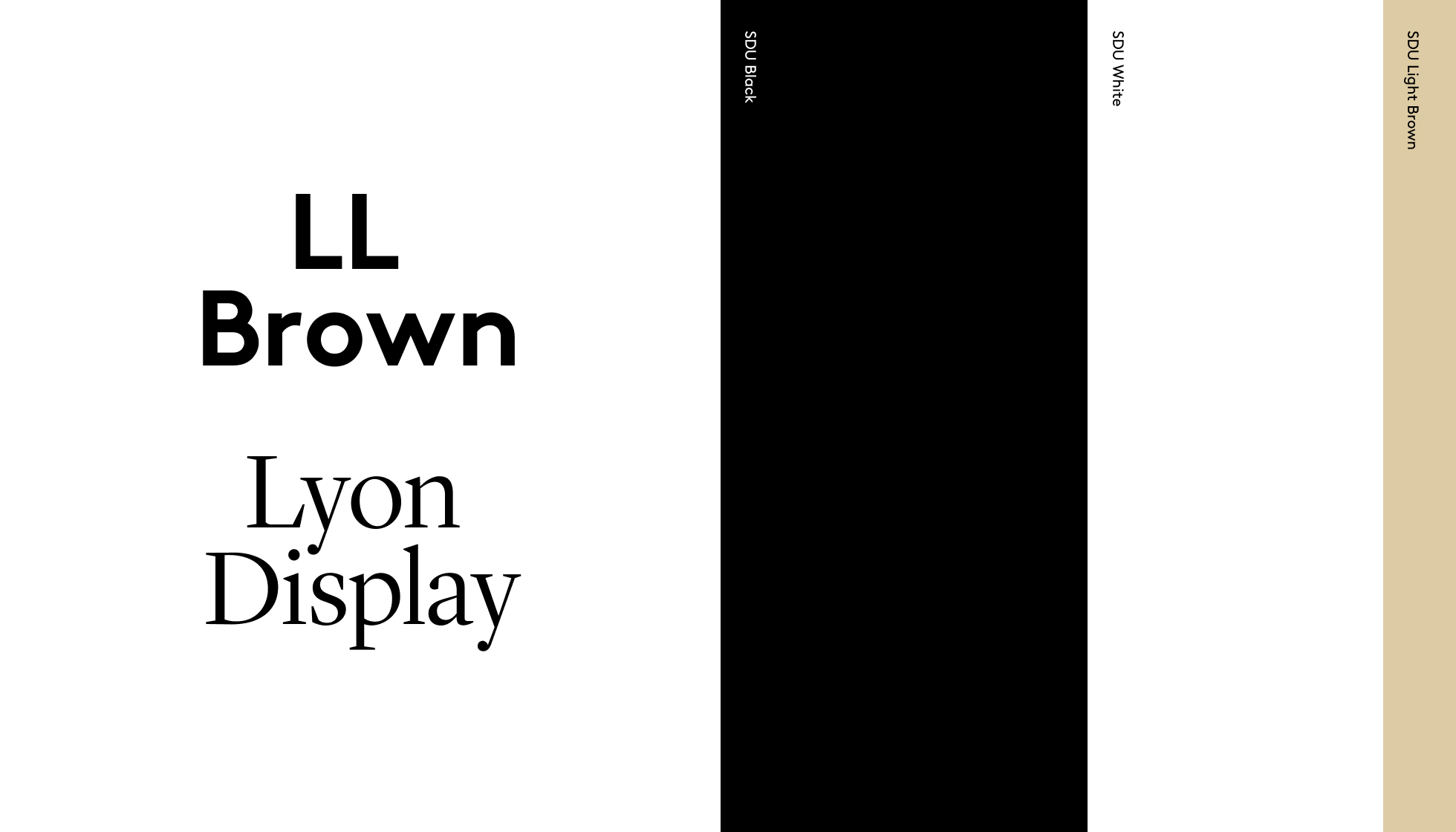
The SDU logo consists of the university name and a symbol. The university name is the acronym “SDU” written in capitals in the LL Brown Pro font. The symbol is a stylised apple bough featuring a section of branch, an apple, and two leaves – one of which is separating from the branch.
The presentation of the name objectively signals focus and a high level of professionalism. The apple bough refers to SDU’s historical heritage, while the leaves point up and forwards to represent SDU’s accessibility and international perspective.
SDU’s primary typography is LL Brown Pro.
This is a geometric, grotesque font featuring simple and clearly shaped letters. It is mainly to be used for headers, publication titles, quotes and other short texts that are to be graphically highlighted.
For longer pieces of body copy – articles, for example – the serif font Lyon Text can be used as a supplement.

In addition to black and white, the SDU colour palette consists of eight colours inspired by the life cycle of the apple tree from seed to ripe fruit.
The colours have been selected as a reference to the SDU symbol (the apple bough) and symbolise the development process of students and research activities.
The colours are used for all contact interfaces that serve as identity carriers.
An answer is hardly ever interesting in and of itself. The fascinating and decisive aspects are to be found in the preceding perspective, in the subtlety, in the question and in a persistent sense of wonderment.
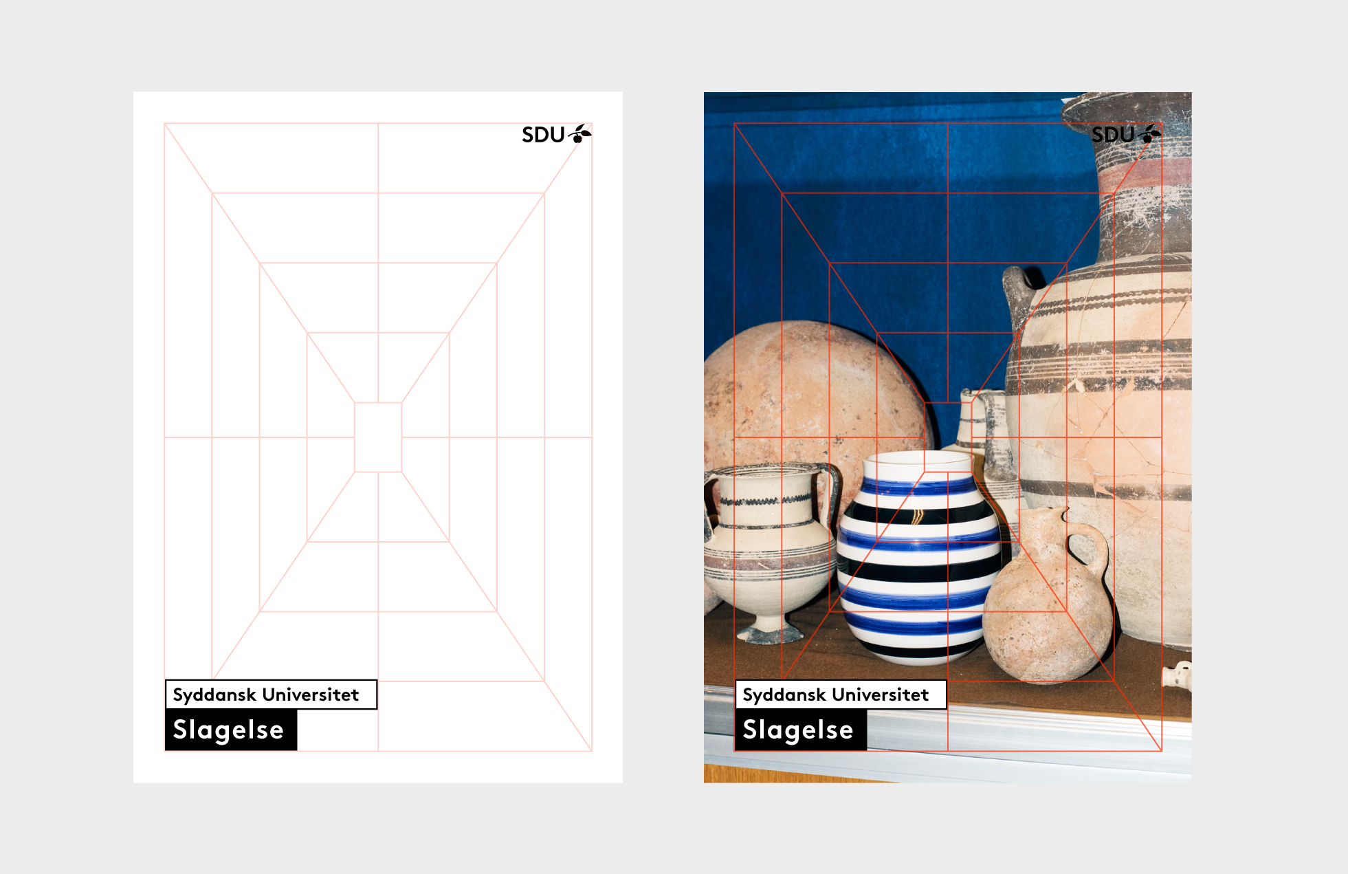
The fifth component of our SDU identity centres on the birth of the perspective – the mathematical grid.


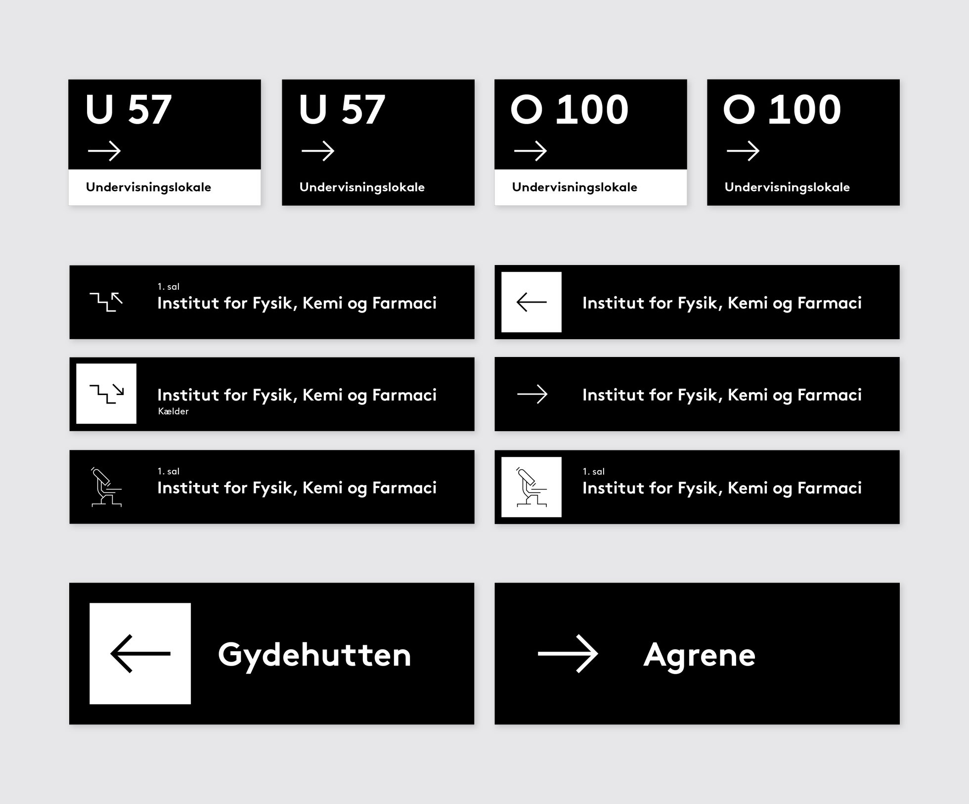
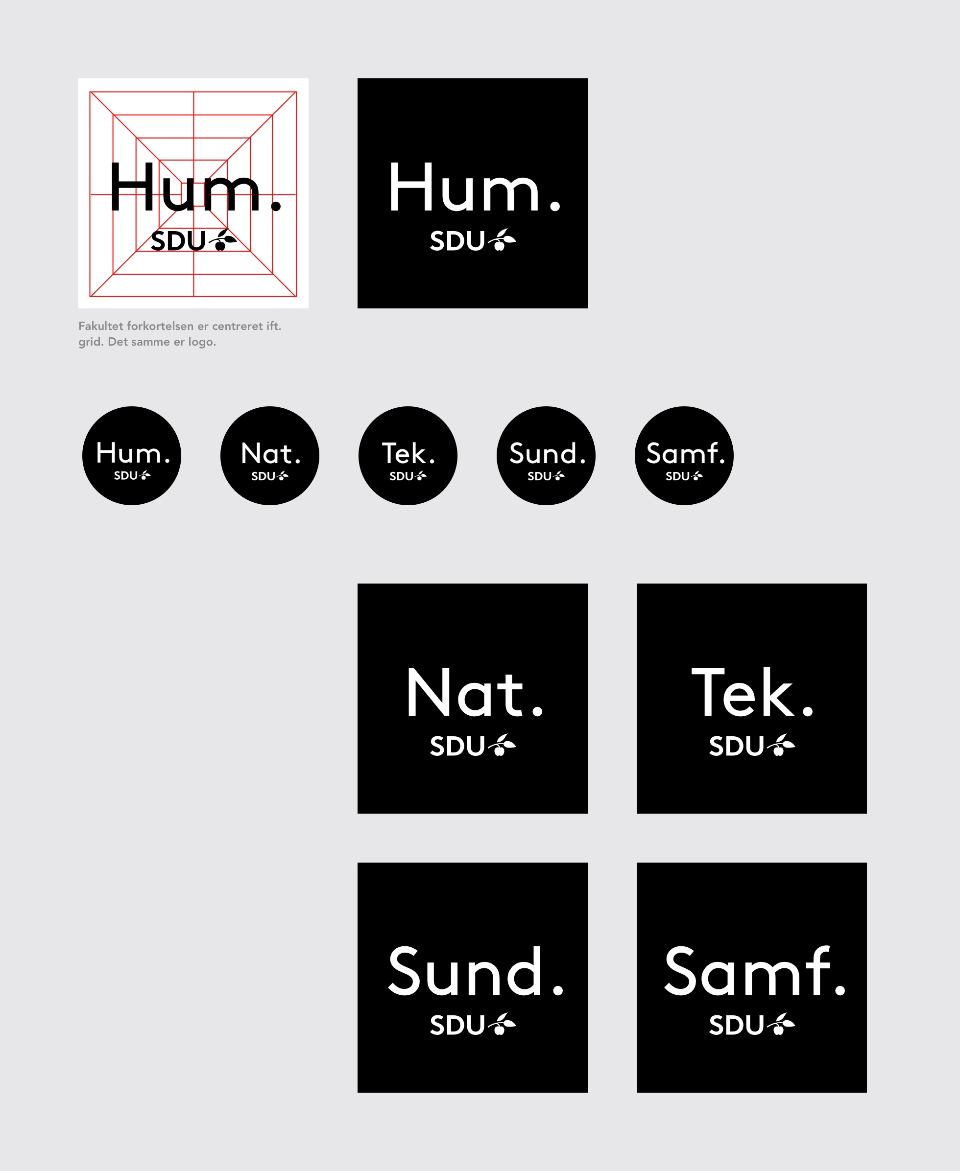
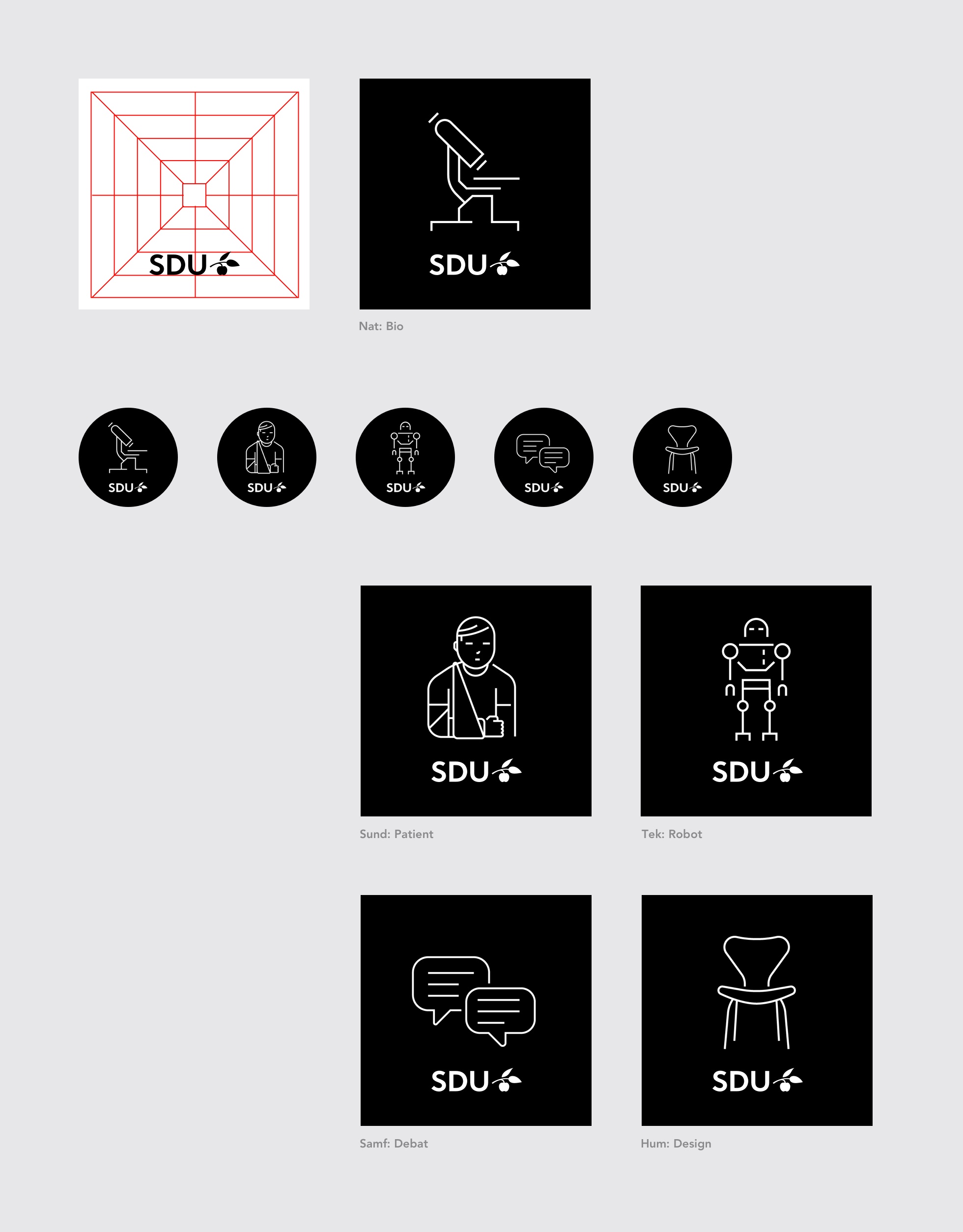
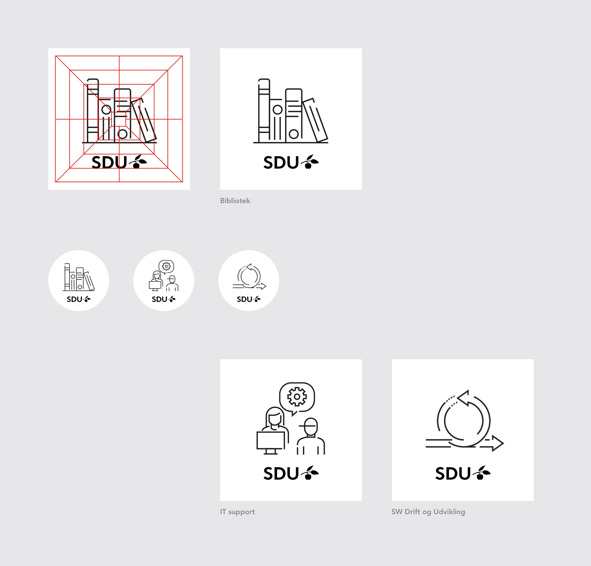
A set of icons is available, comprising an icon for each campus and a series of icons for each faculty.
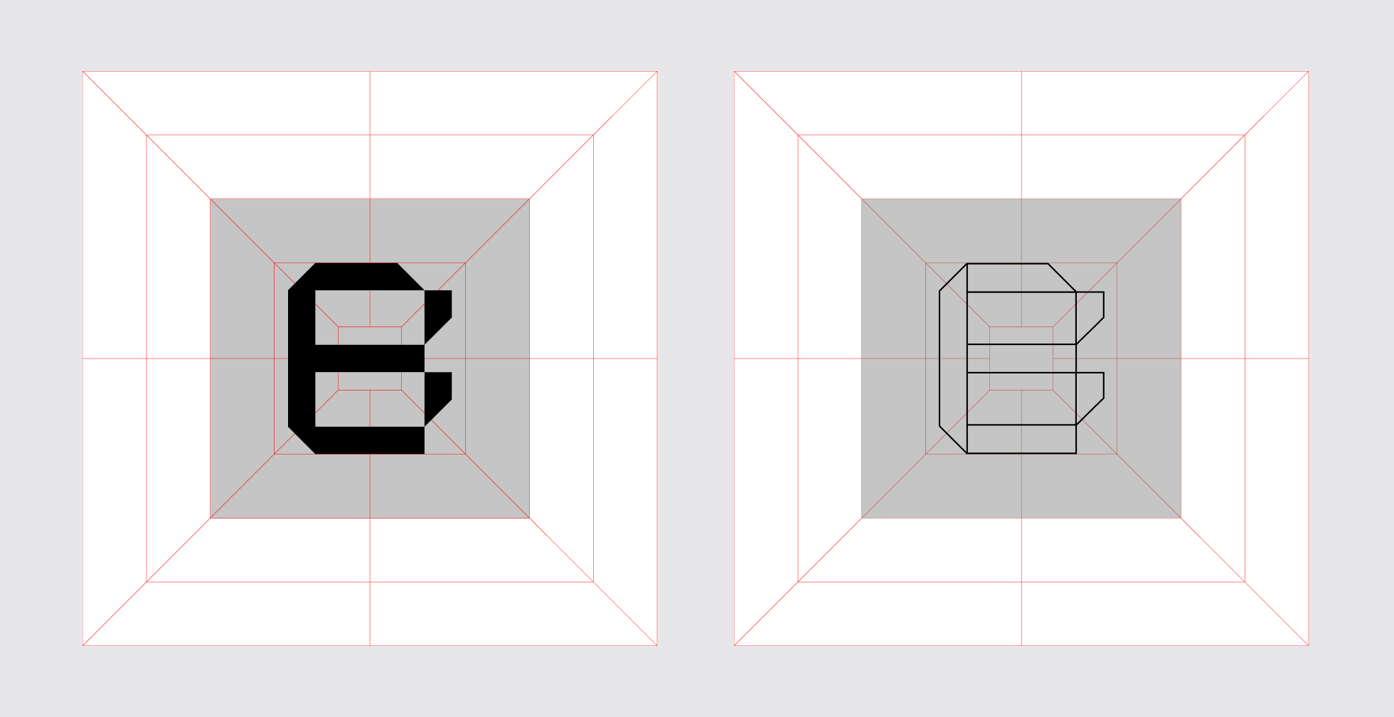
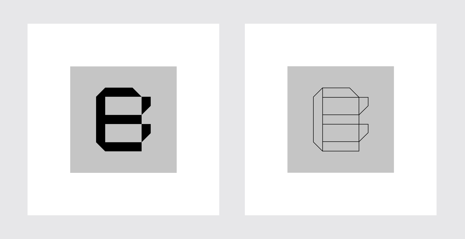
Perspective Display has been specially developed for SDU for use in the identity perspective grid. There is both a Regular and a Wired version. The typography is used as a visual element, with one or two letters or digits at a time – as a “guiding” element that supports the content. Never use it to write long words out in full, but try to use it in as large a pitch as the layout allows.


Faculty of Humanities
Faculty of Science
Faculty of Business and Social Sciences
Faculty of Health Sciences
Faculty of Engineering
Download a pdf with the photography brief below (in Danish):

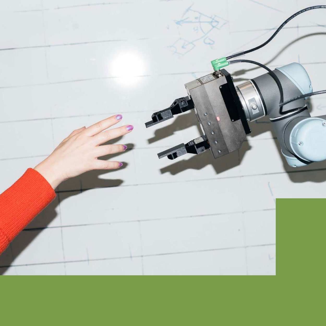
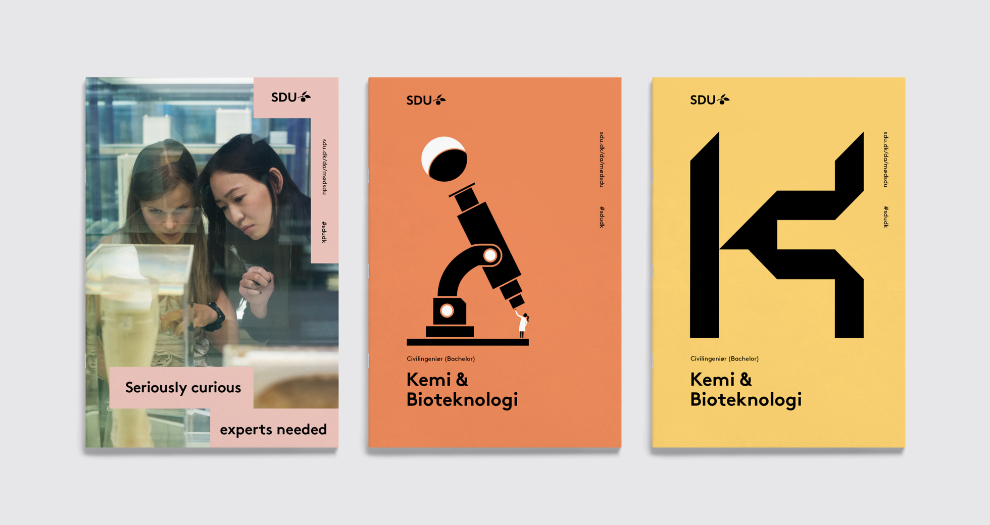
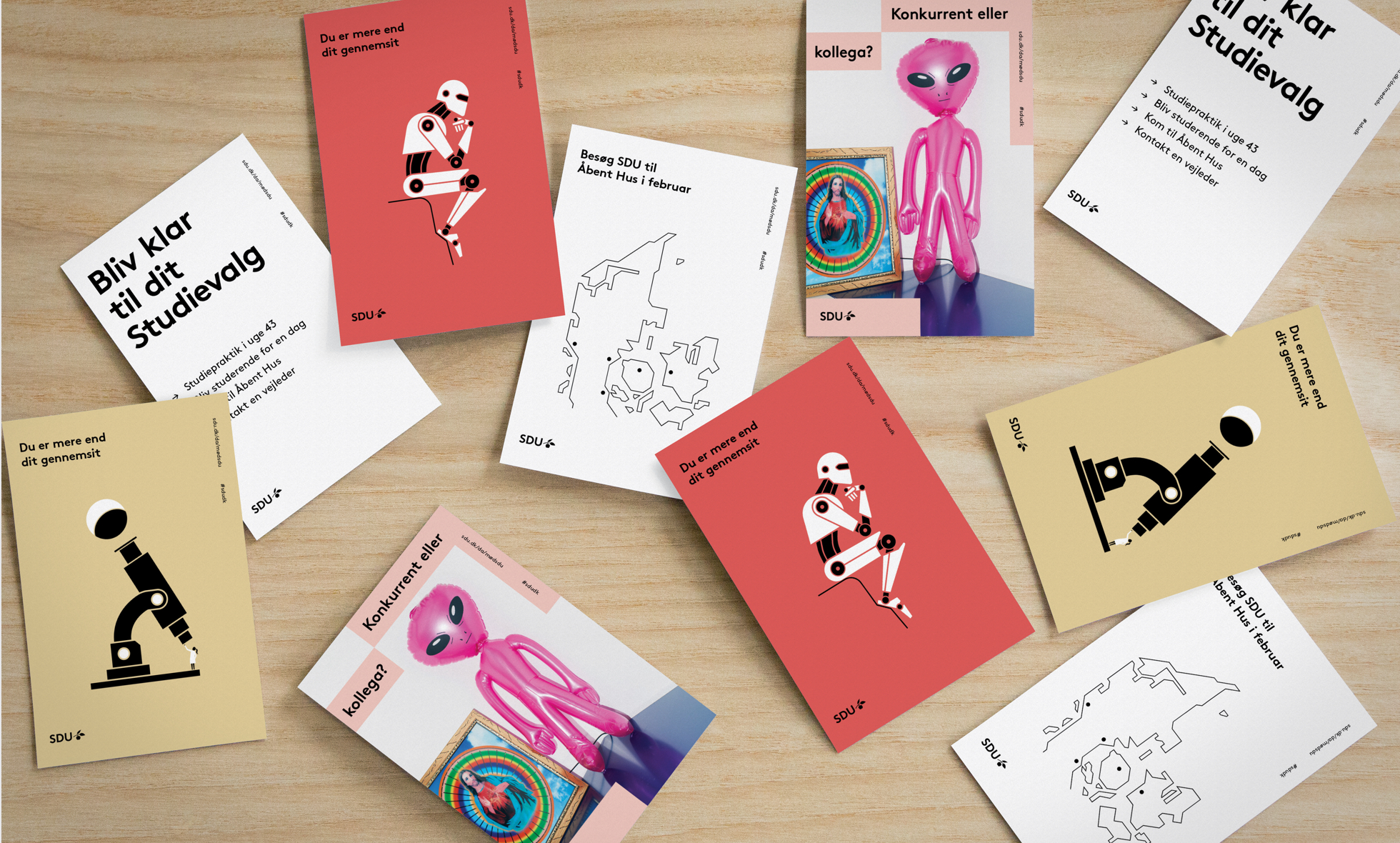
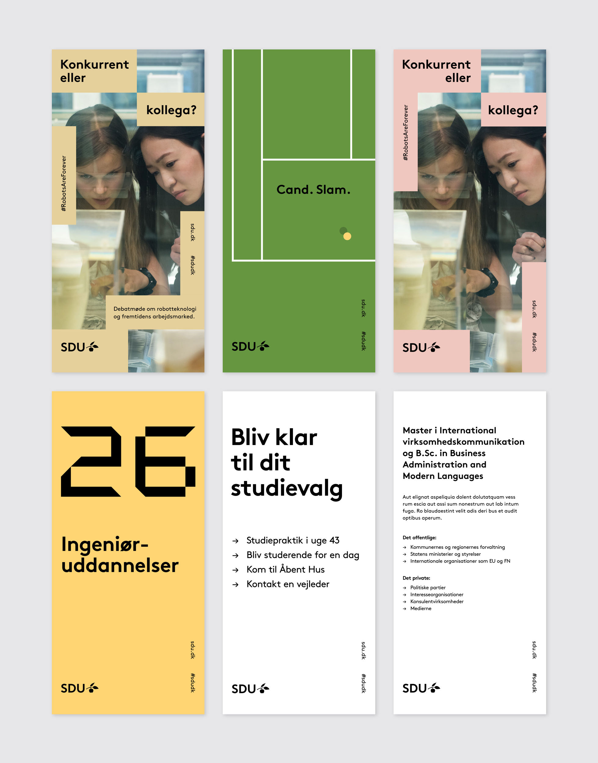
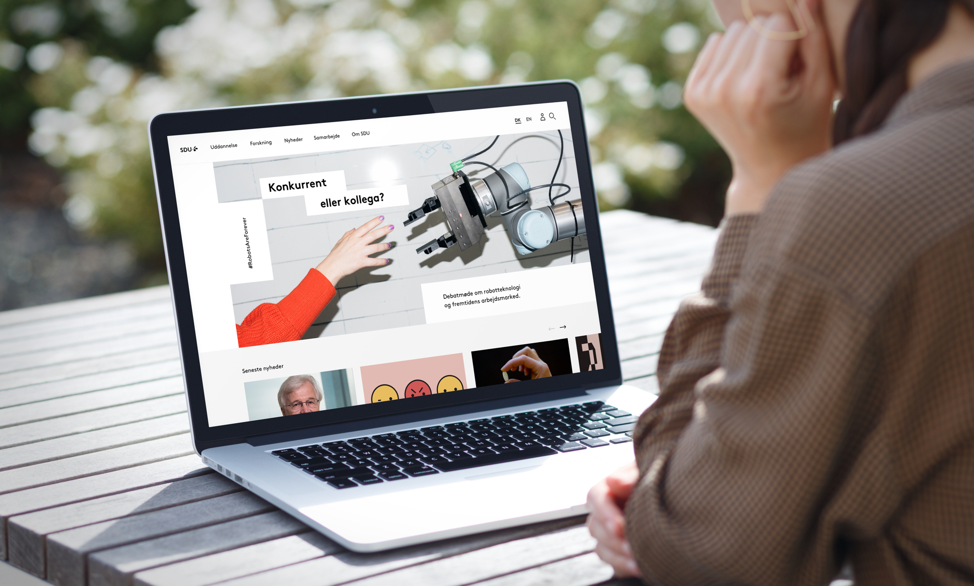
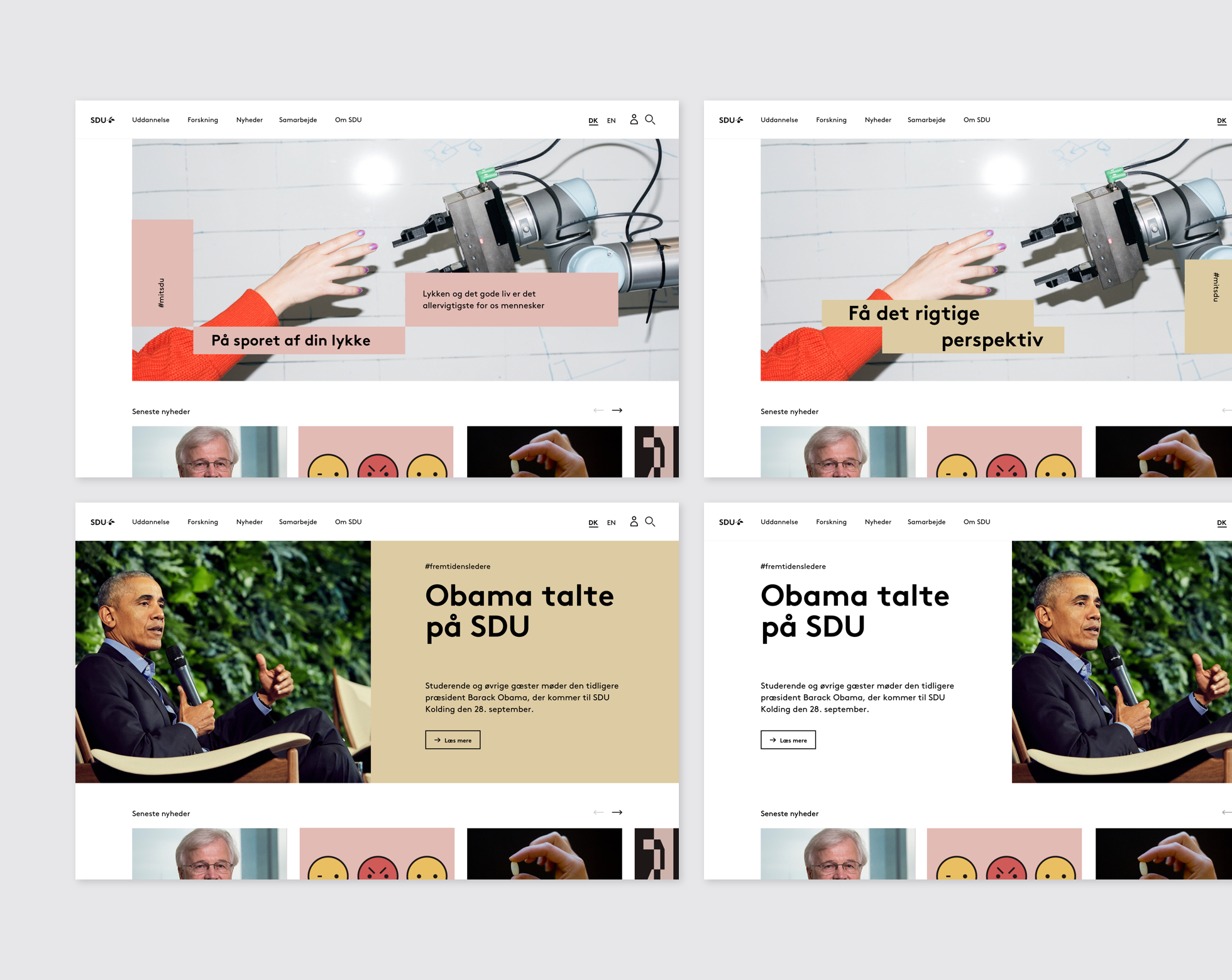
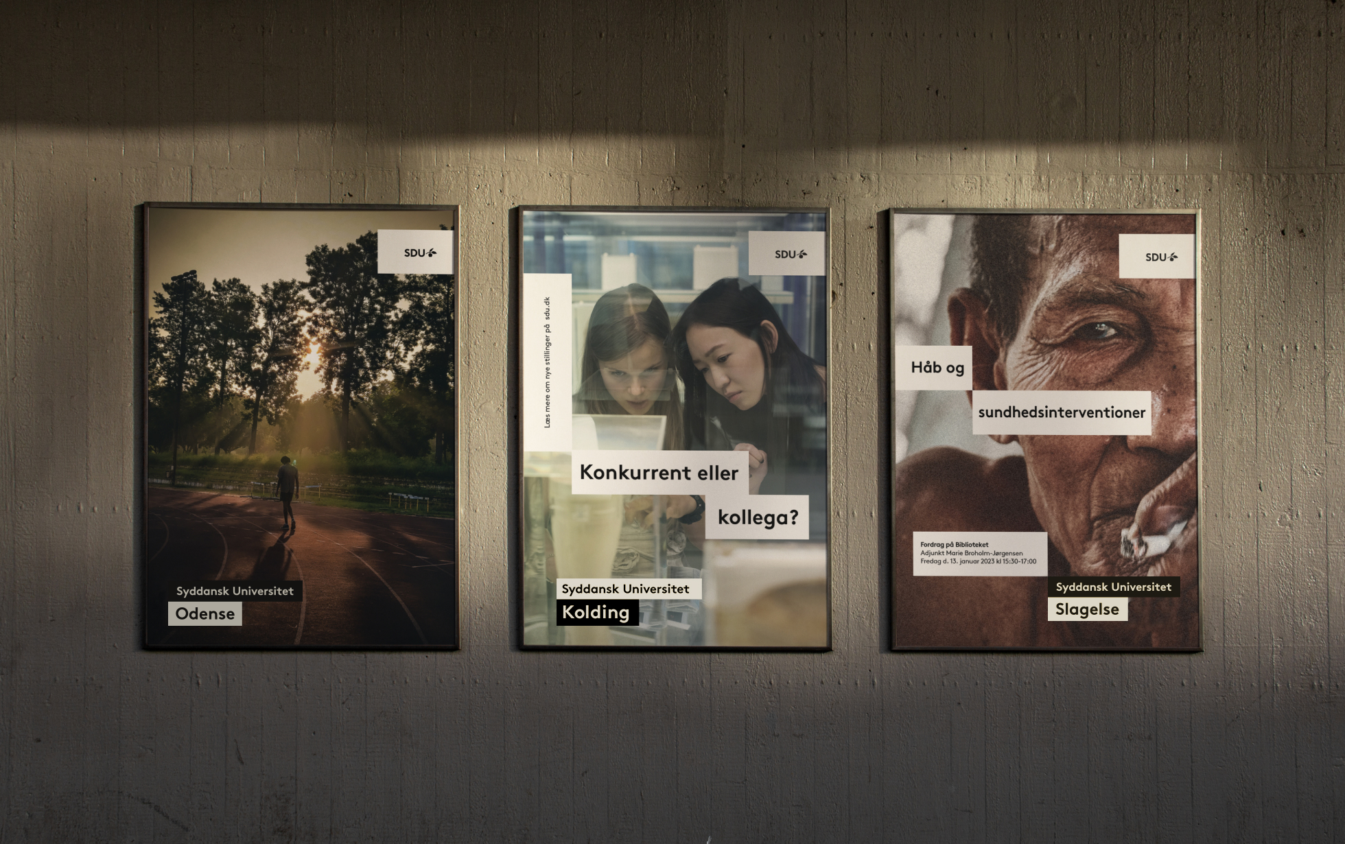
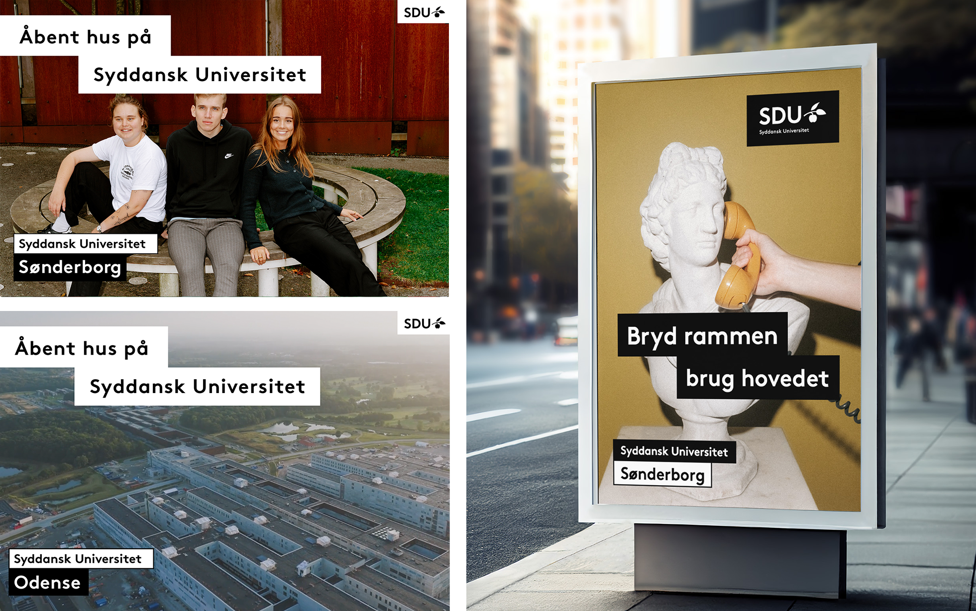
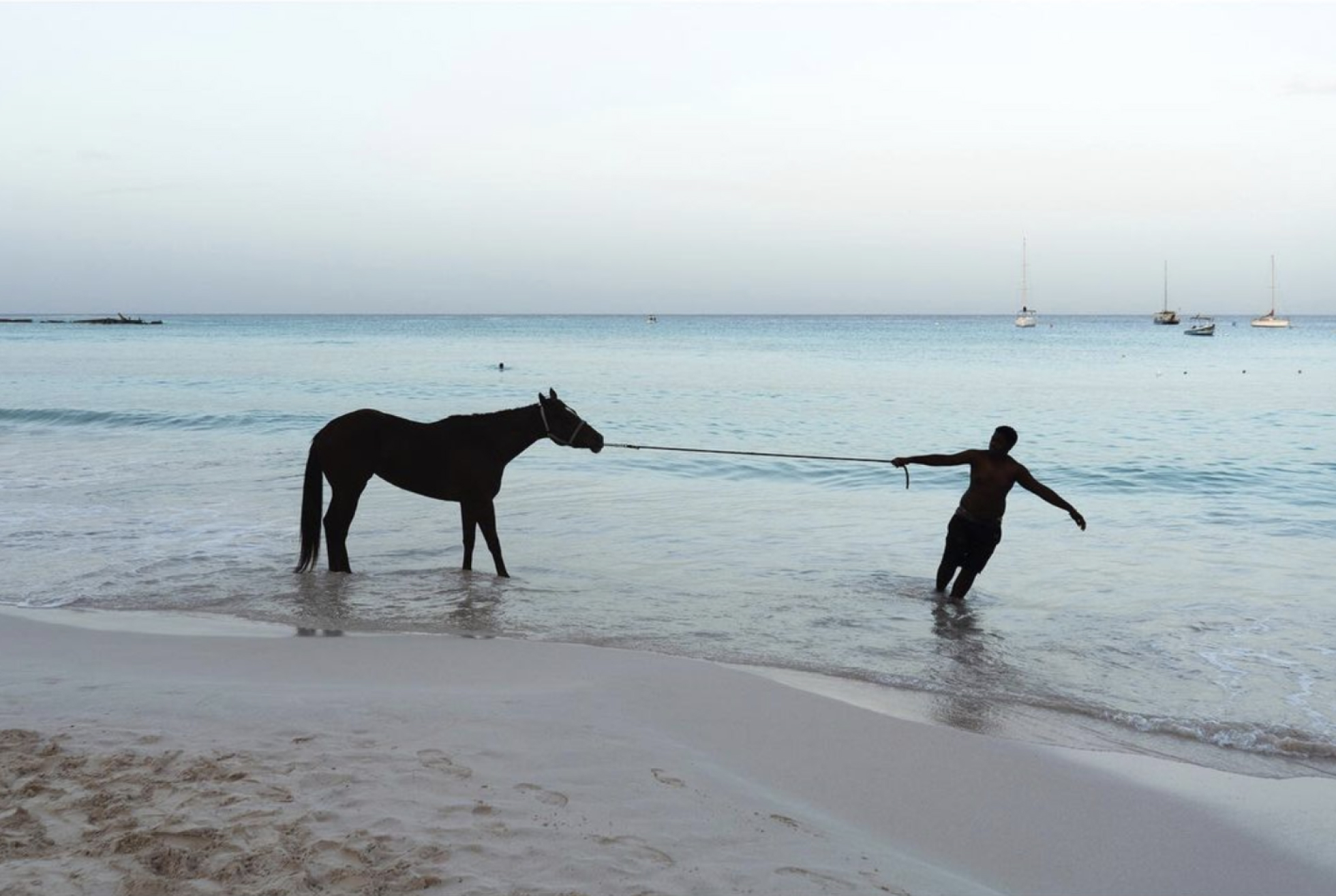
SDU has assembled a pool of new photos from the different campuses, photos with a distinct style and a hint of “edge”.
They are conceptual images that can be used to cover “academic content”/perspective, and to reference passion for the academic fields, research and so on.
We have consciously avoided classic, clichéd motifs and stock images, striving instead to add a surprising element to the pictures.
The photos are intended to stimulate curiosity and, together with the name of the study programme/header, to be interpreted in “new” and different ways.


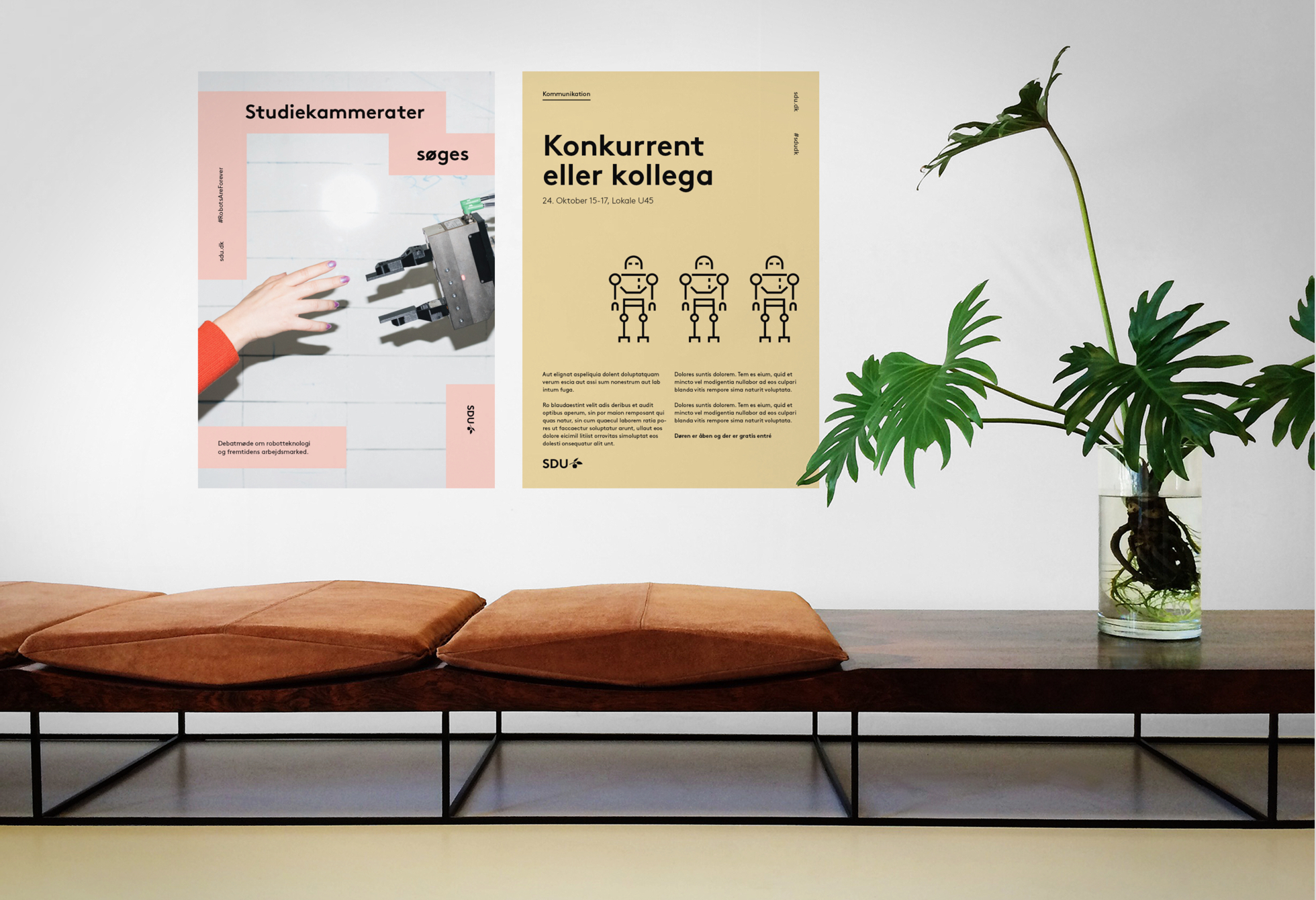
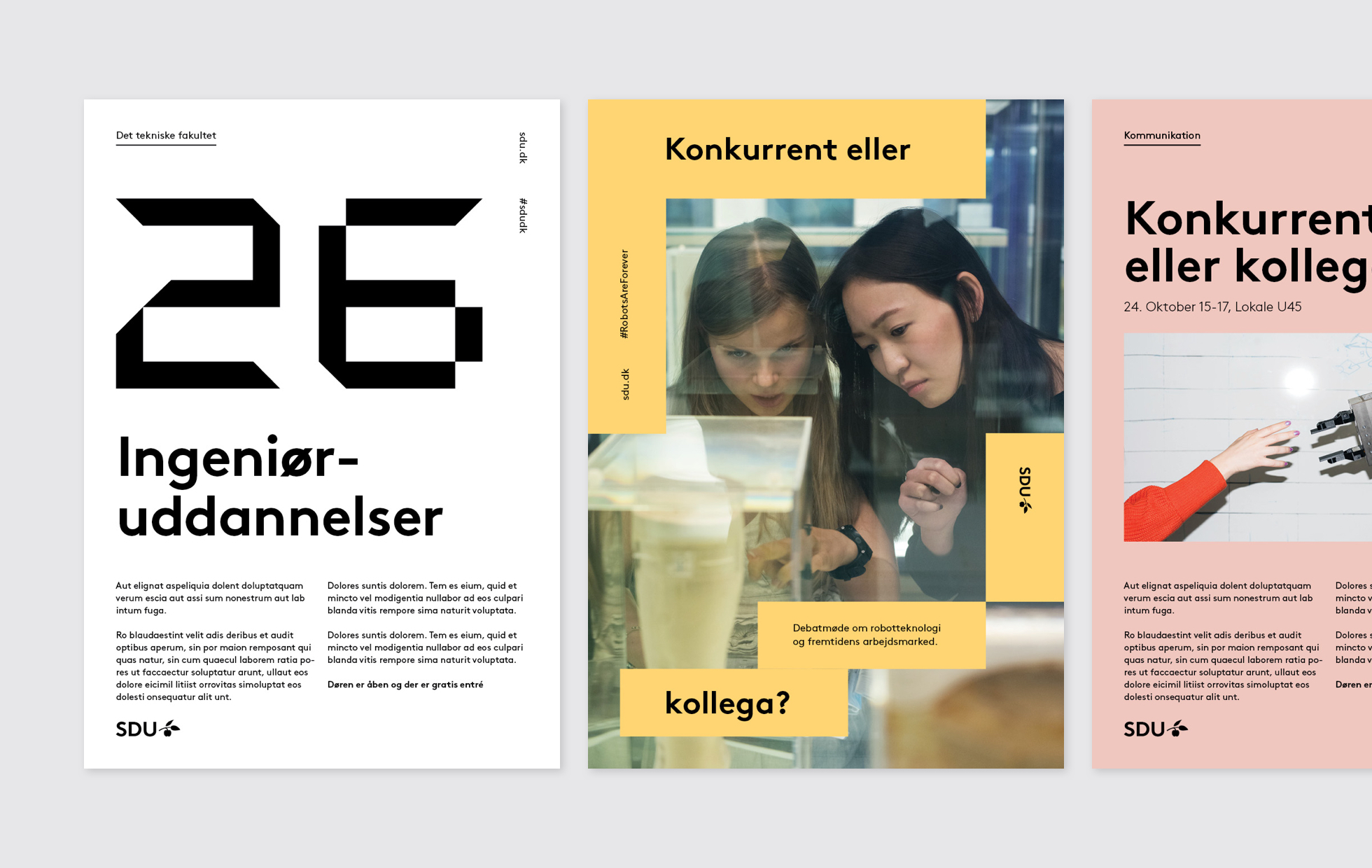
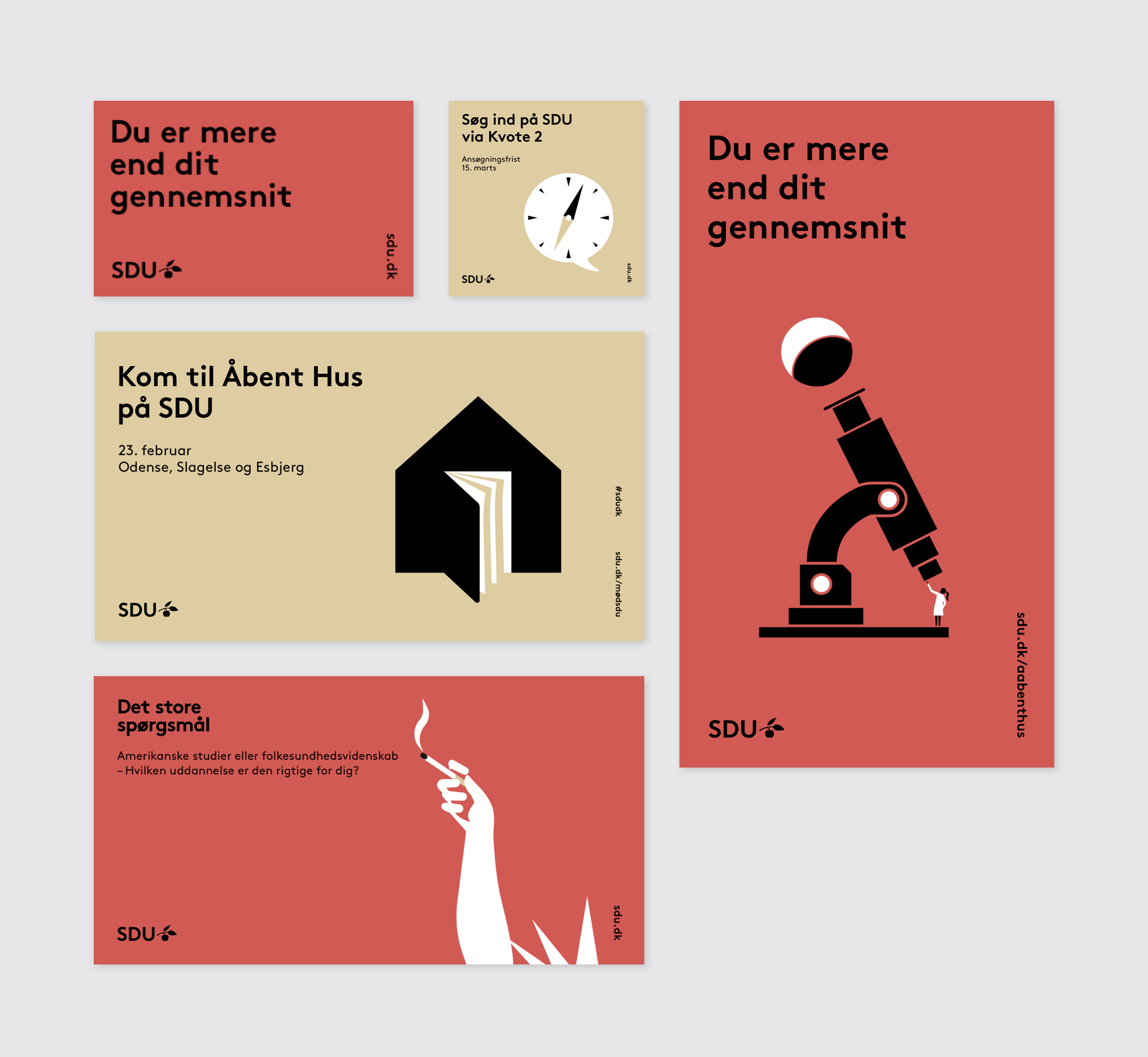
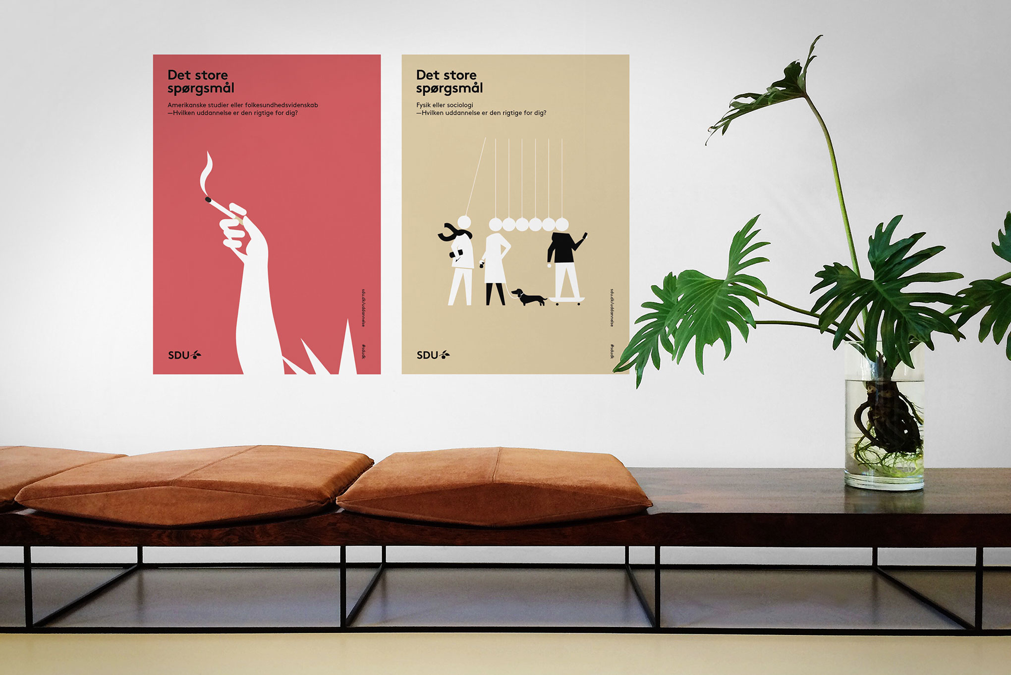
Posters
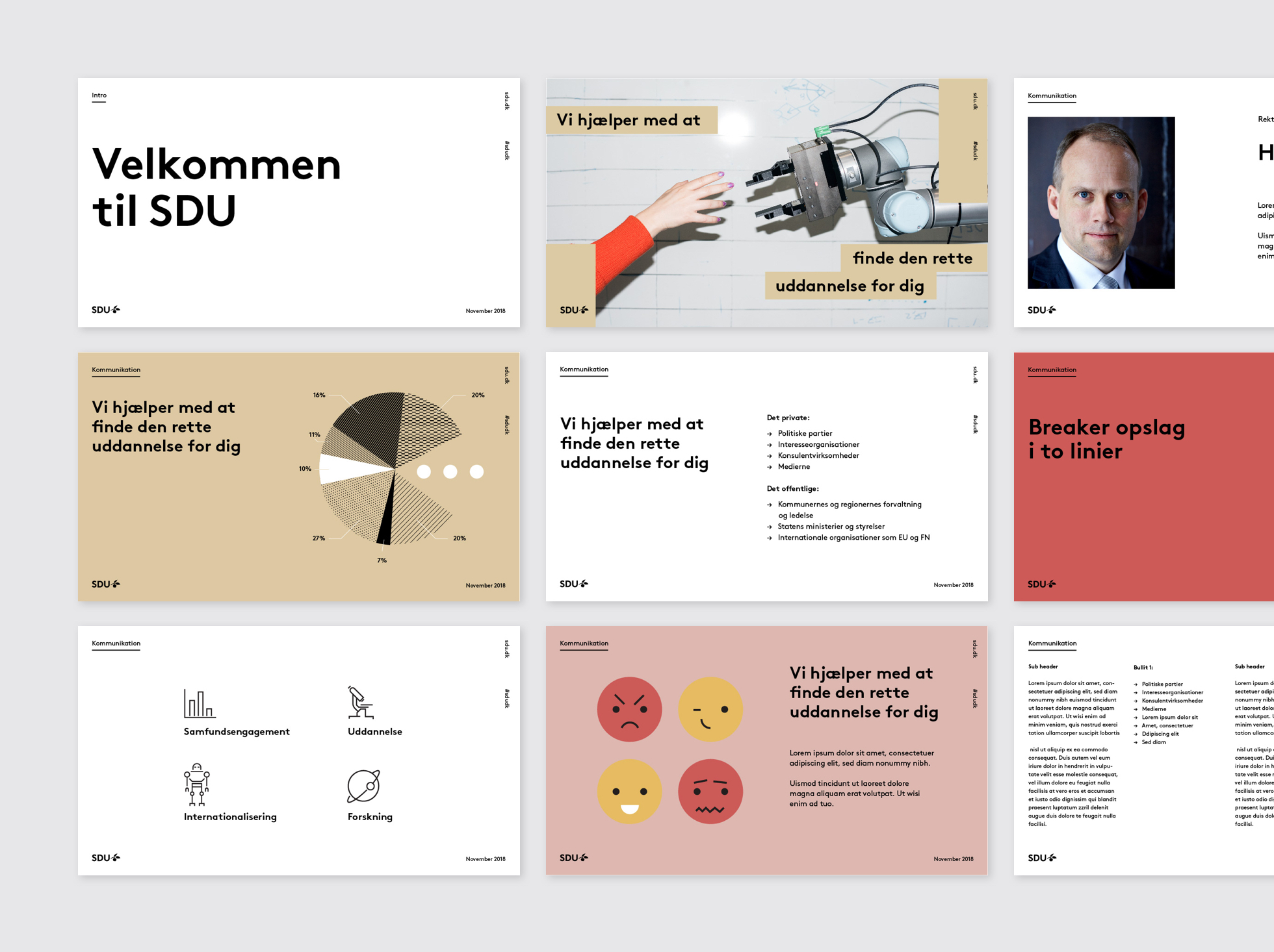
PowerPoint presentations
Advertisements
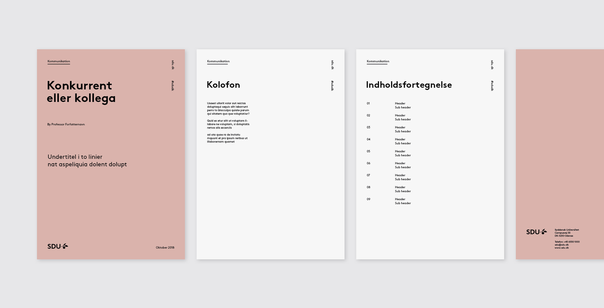
Folder, A4
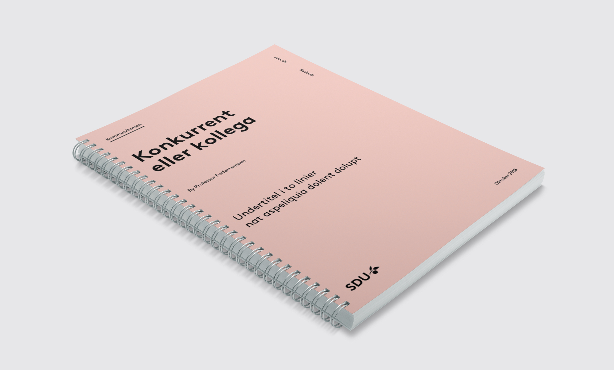
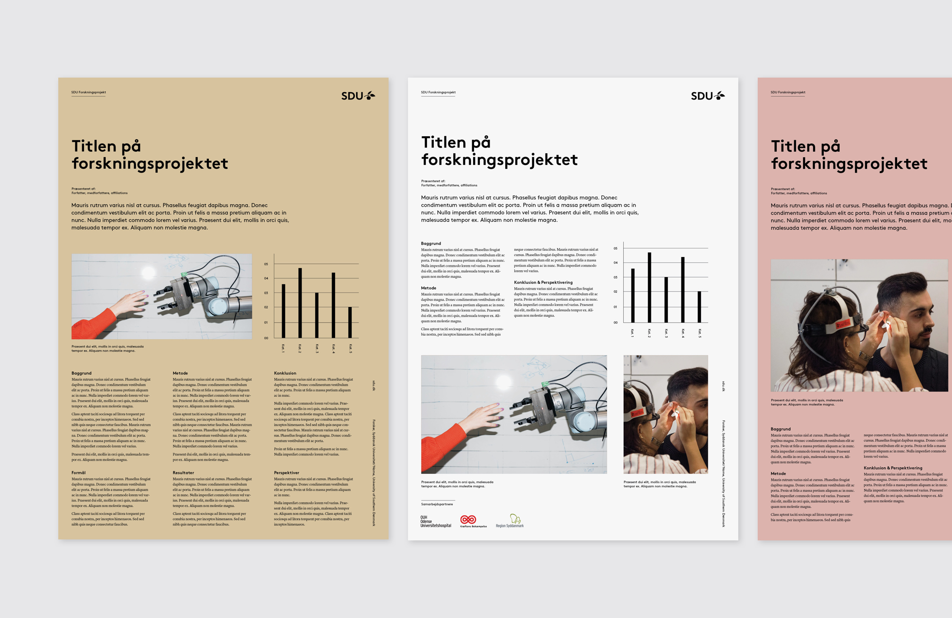
Report cover, A4
Researcher posters
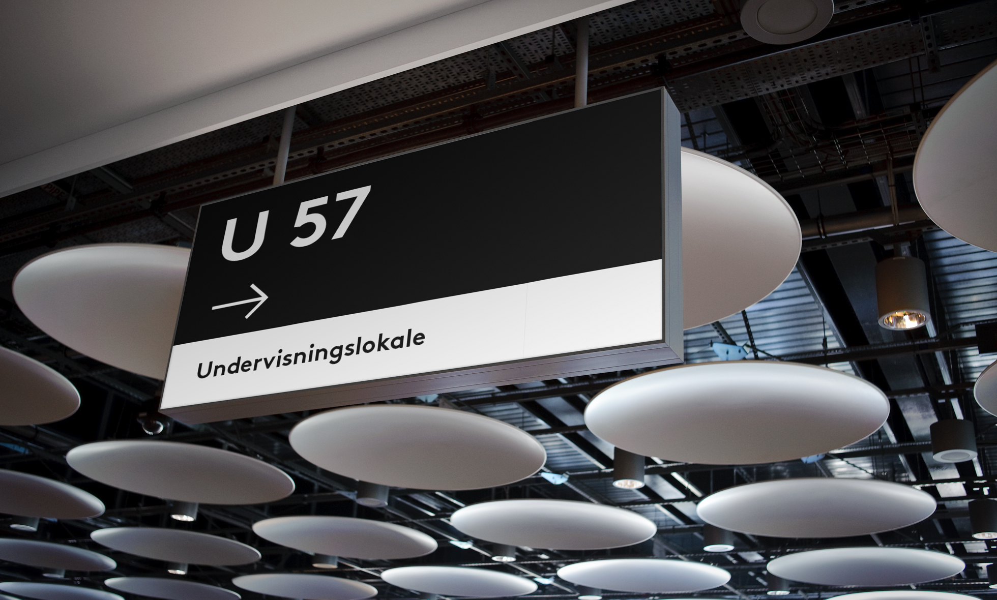
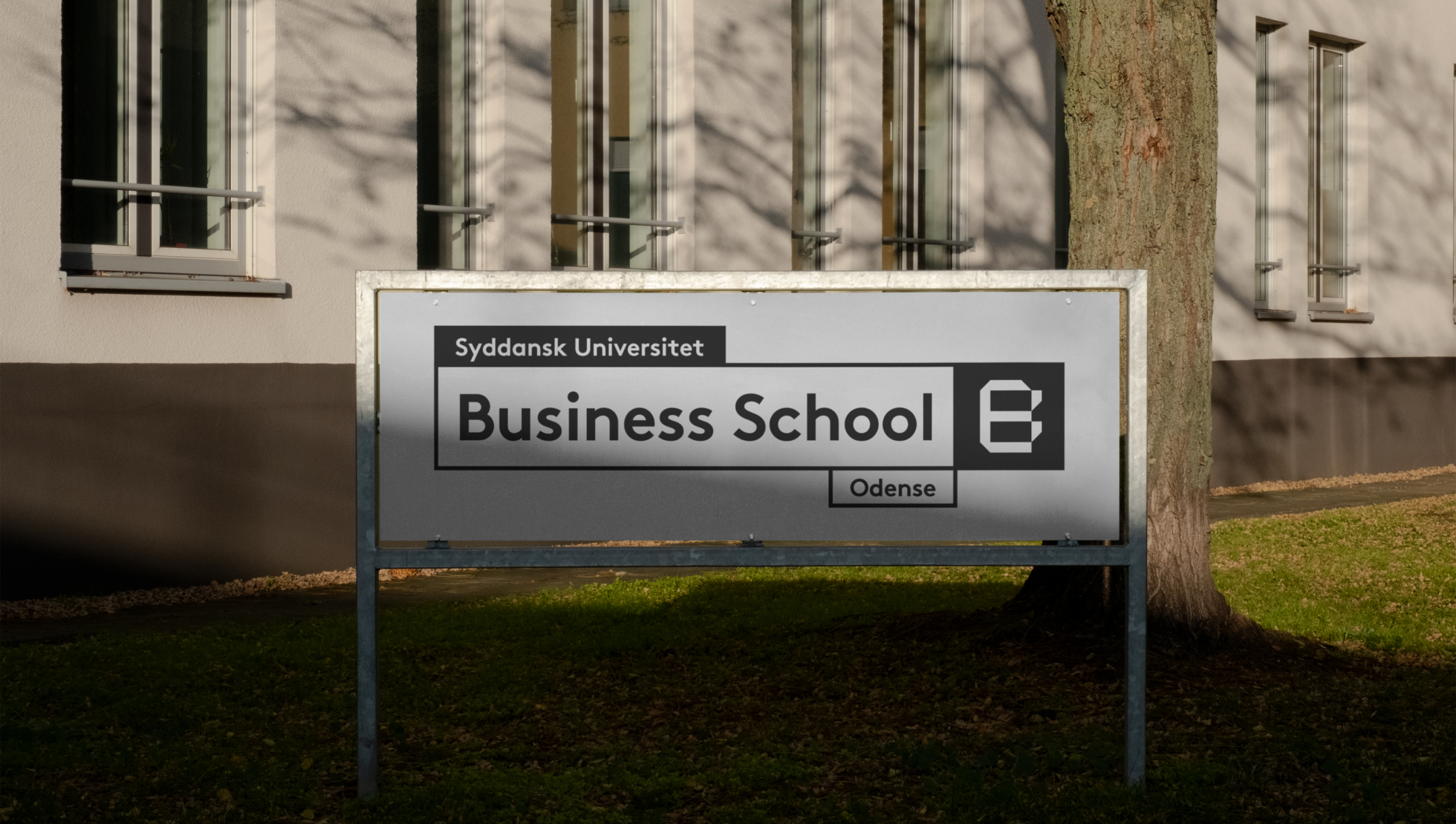
Signage
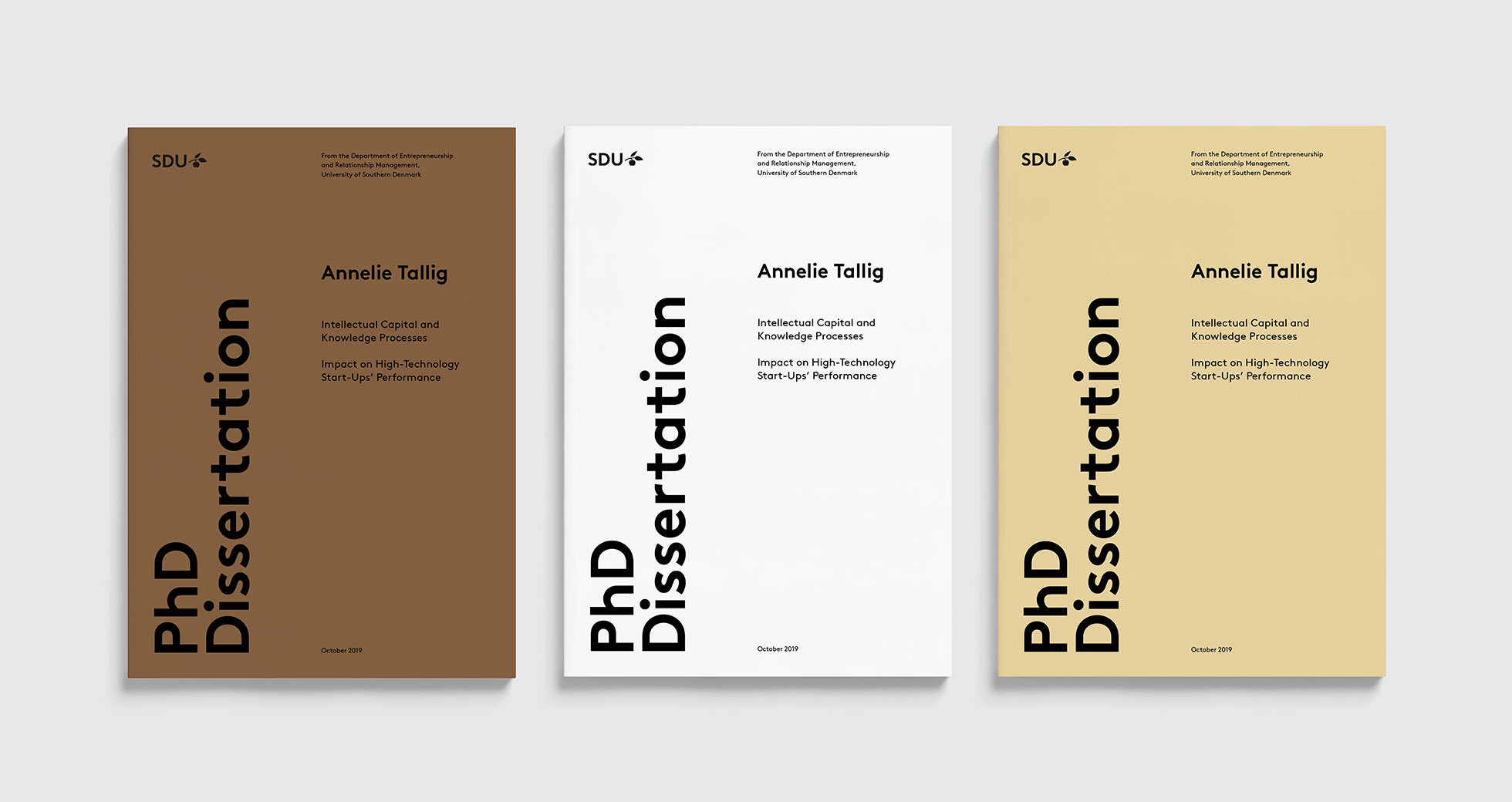
PhD thesis, A4
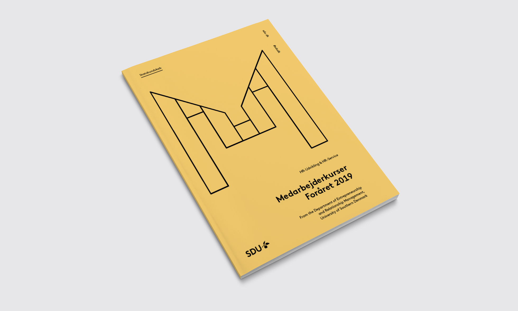
Employee publication, A4
Covers for A5 pamphlet
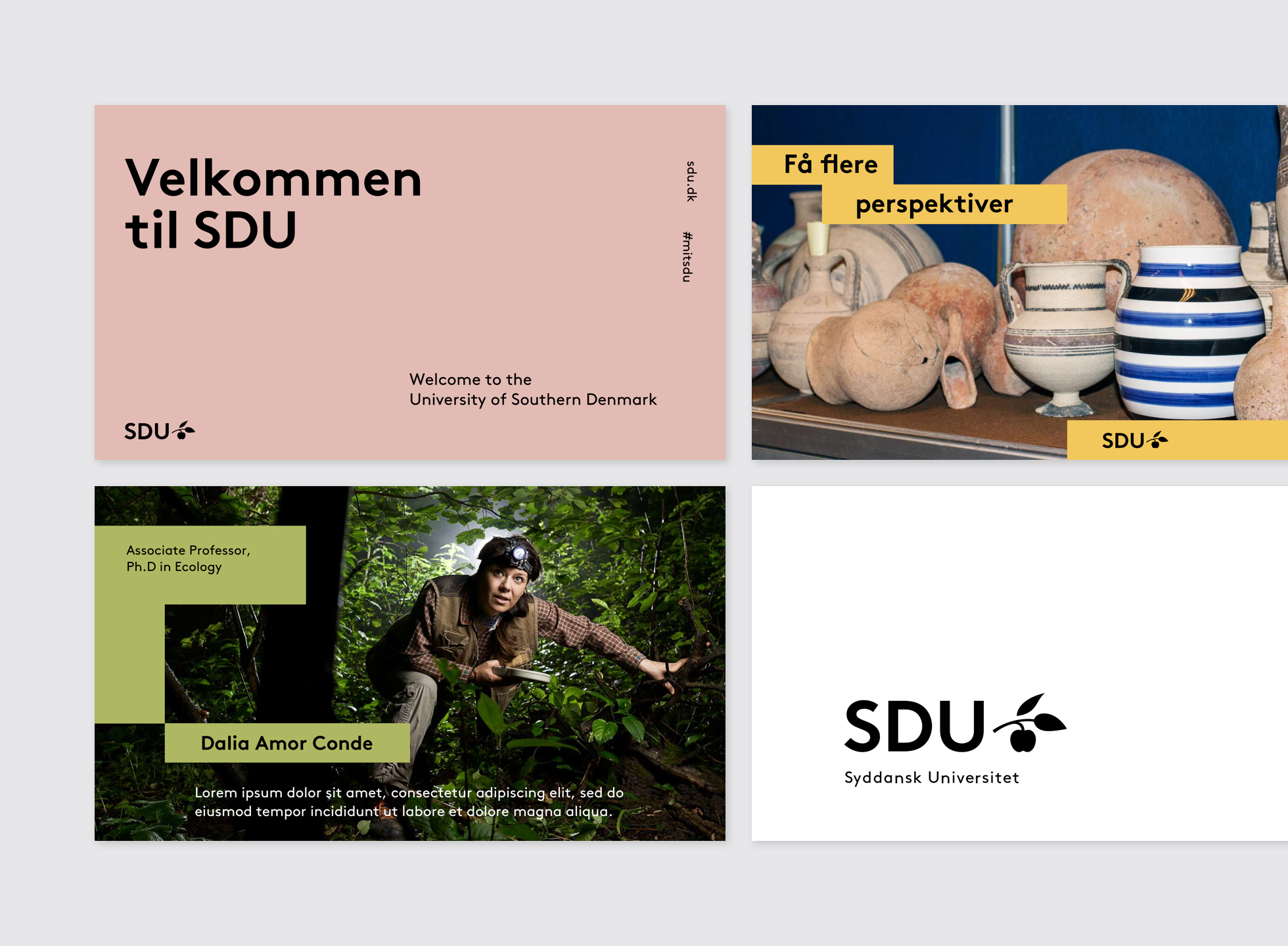
Postcard, A5
Roll-up banners
Website top banners
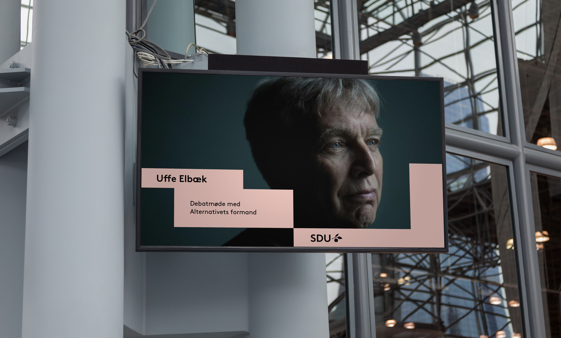
Screens – indoor and outdoor
Film graphics
Digital banners
Admission Campaign 2019
Below are examples of how to apply the identity in practice. There are links to download templates created in InDesign, Illustrator and Photoshop, as well as links to templates available in Templafy.

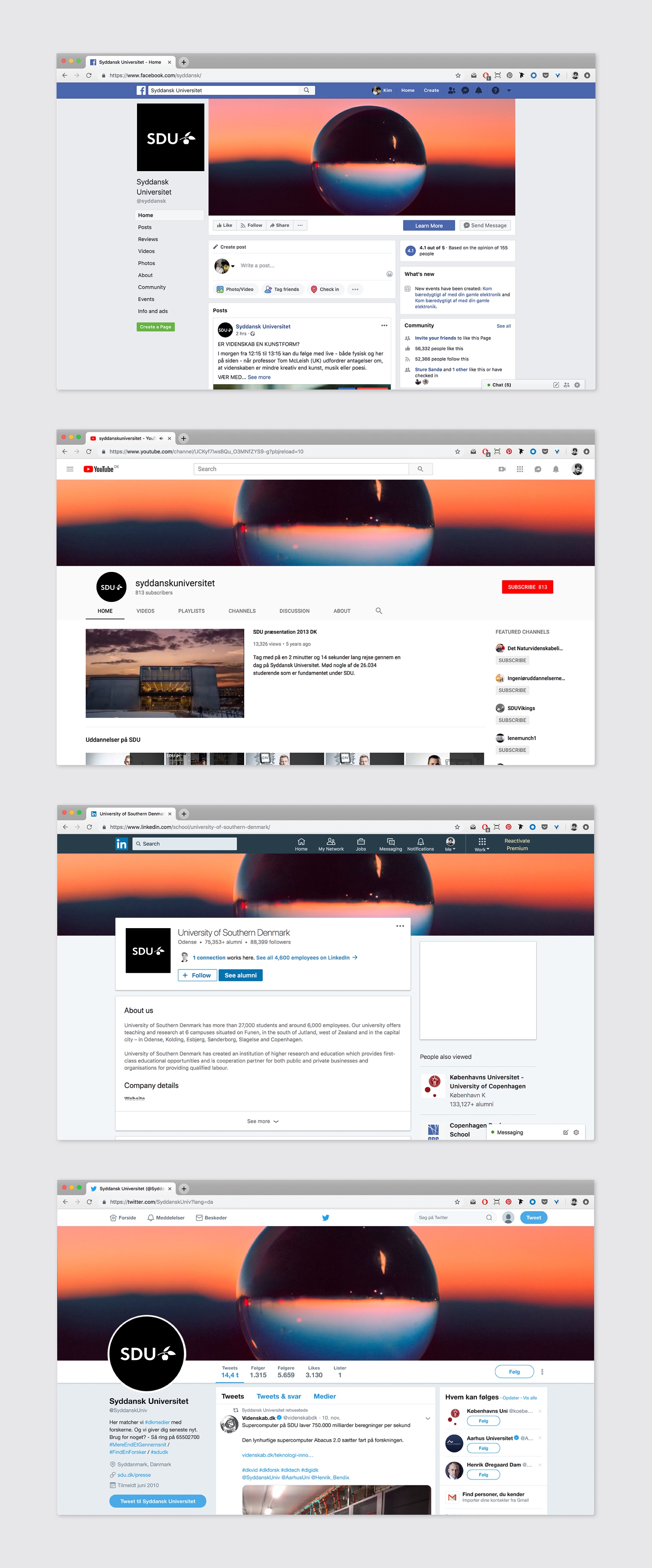
Guidelines for profile and cover photos for social media. When creating new profile images, our SDU brand grid is used to ensure a consistent, brand-compliant layout.
Standard branding is generally used by all units under SDU.
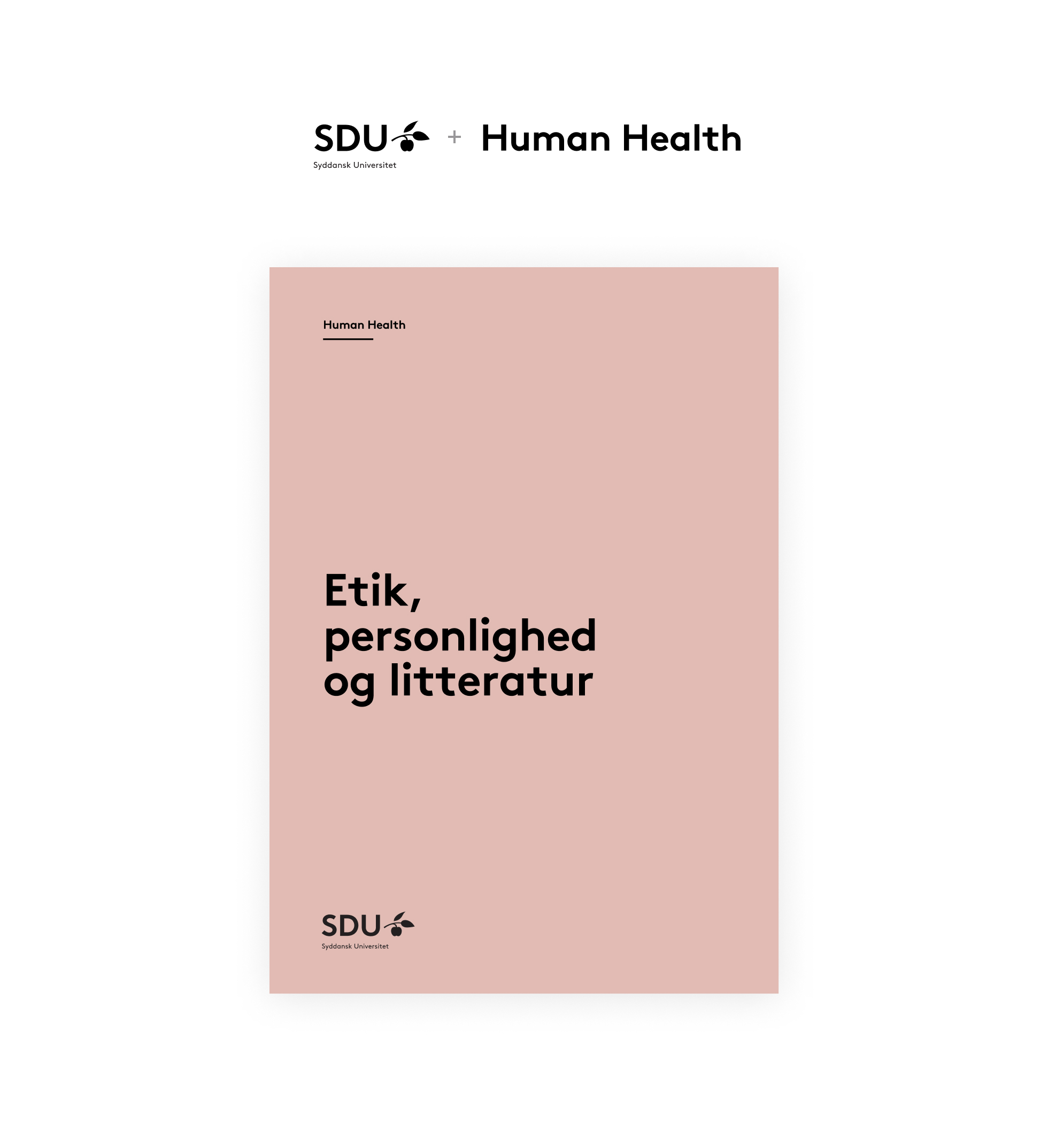
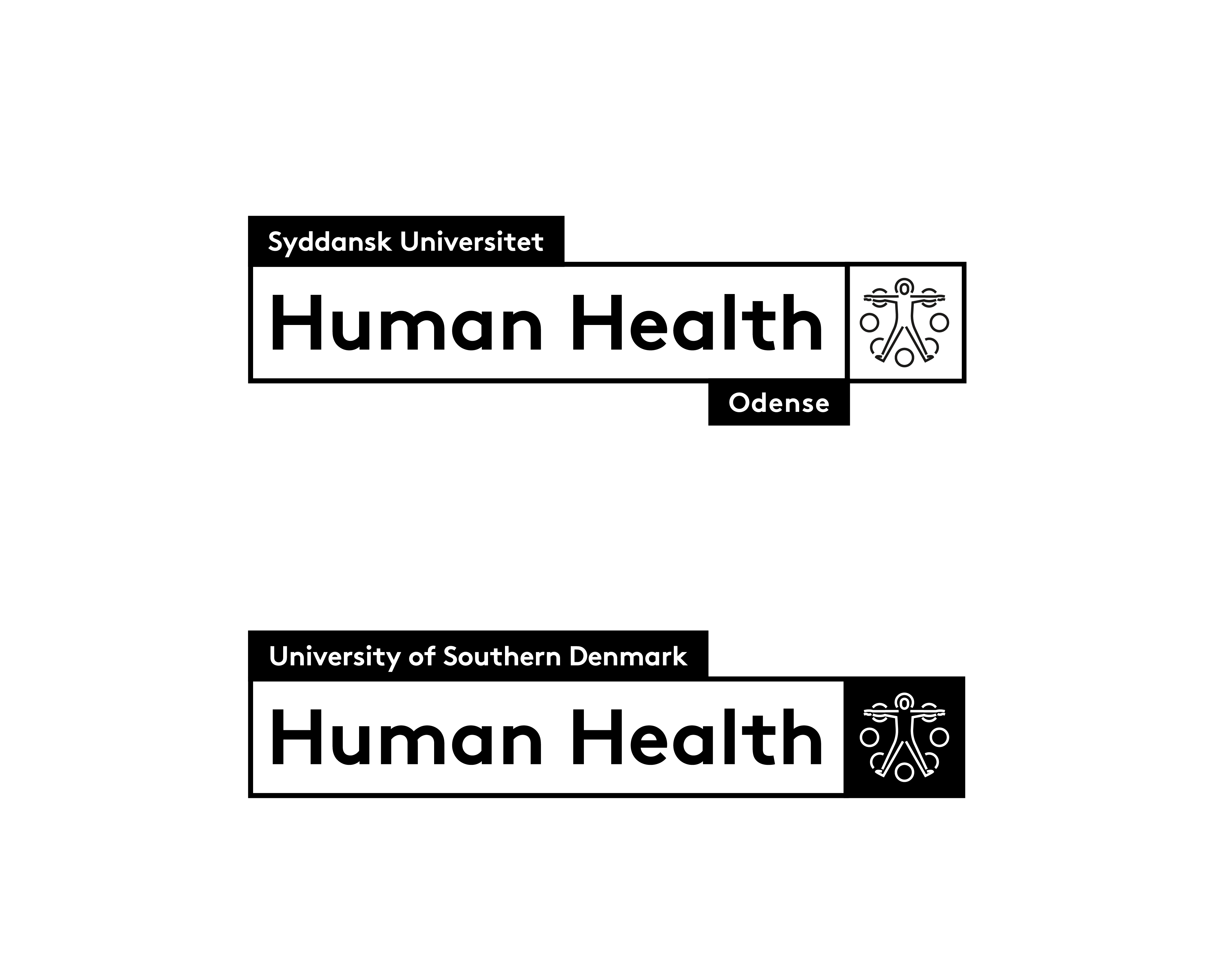
Special logos for units, projects and centres are designed by the art director of SDU Communications based on proposals and dialogue with the client.


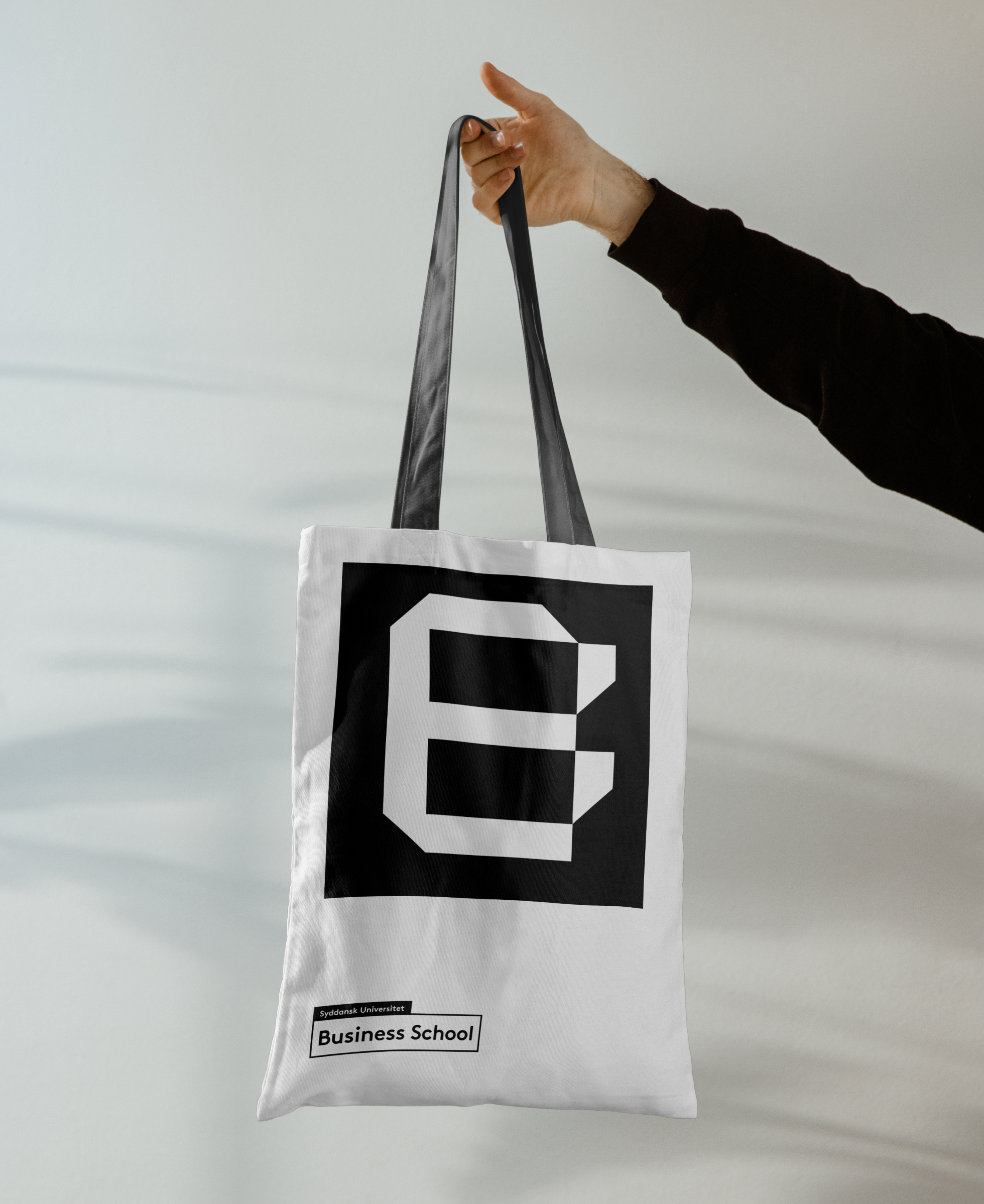
The University of Southern Denmark Business School has its own identity-within-an-identity to create internal connection and external attraction. The identity builds on the existing core values and design system but has a sharpened profile with its own core messages, a more stringent colour palette and its own logo.

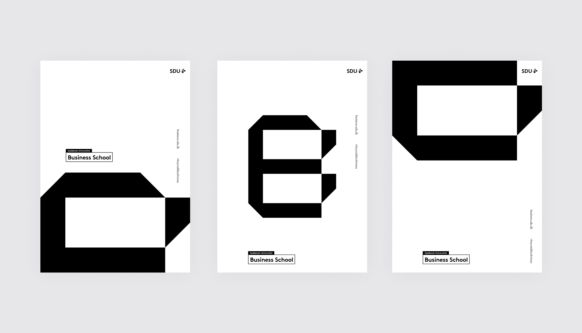
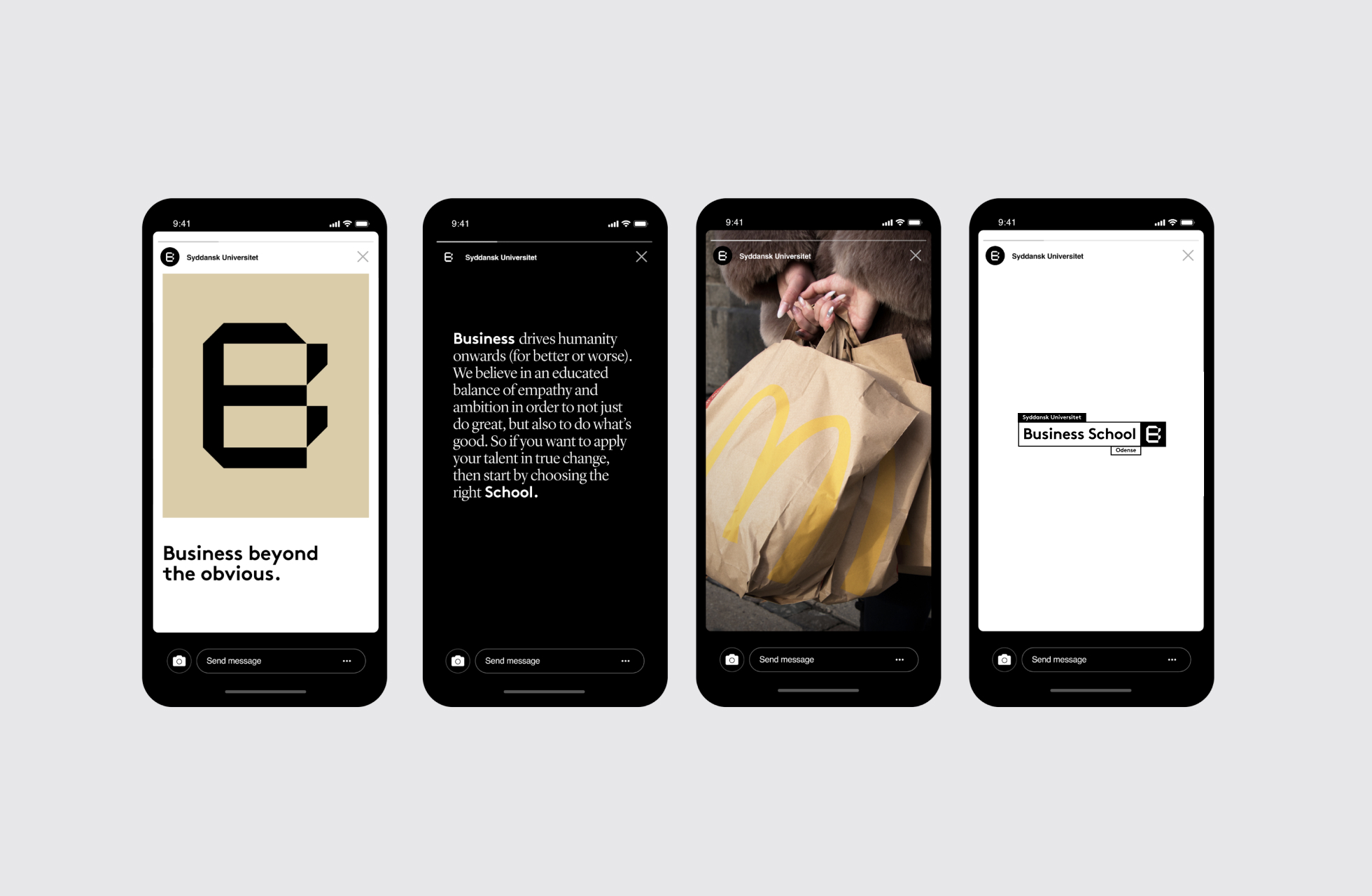
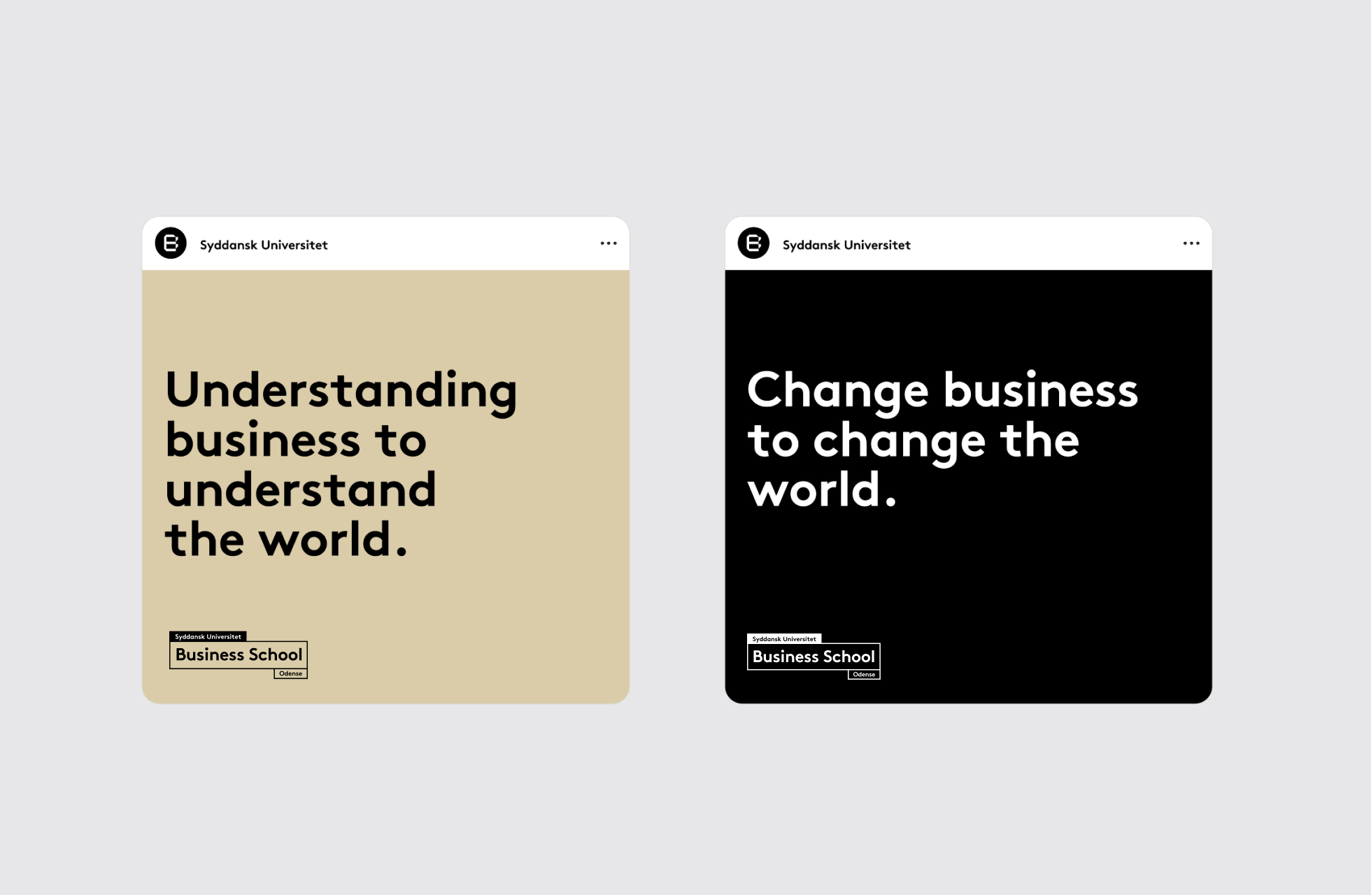
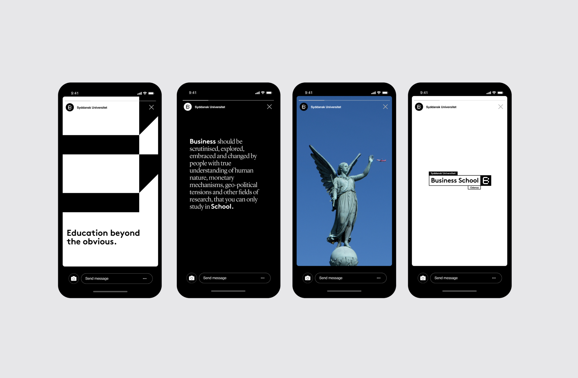
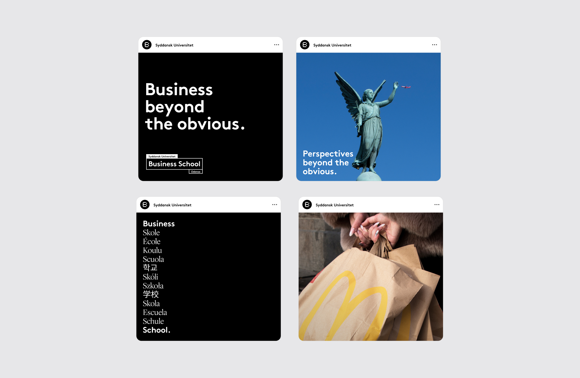
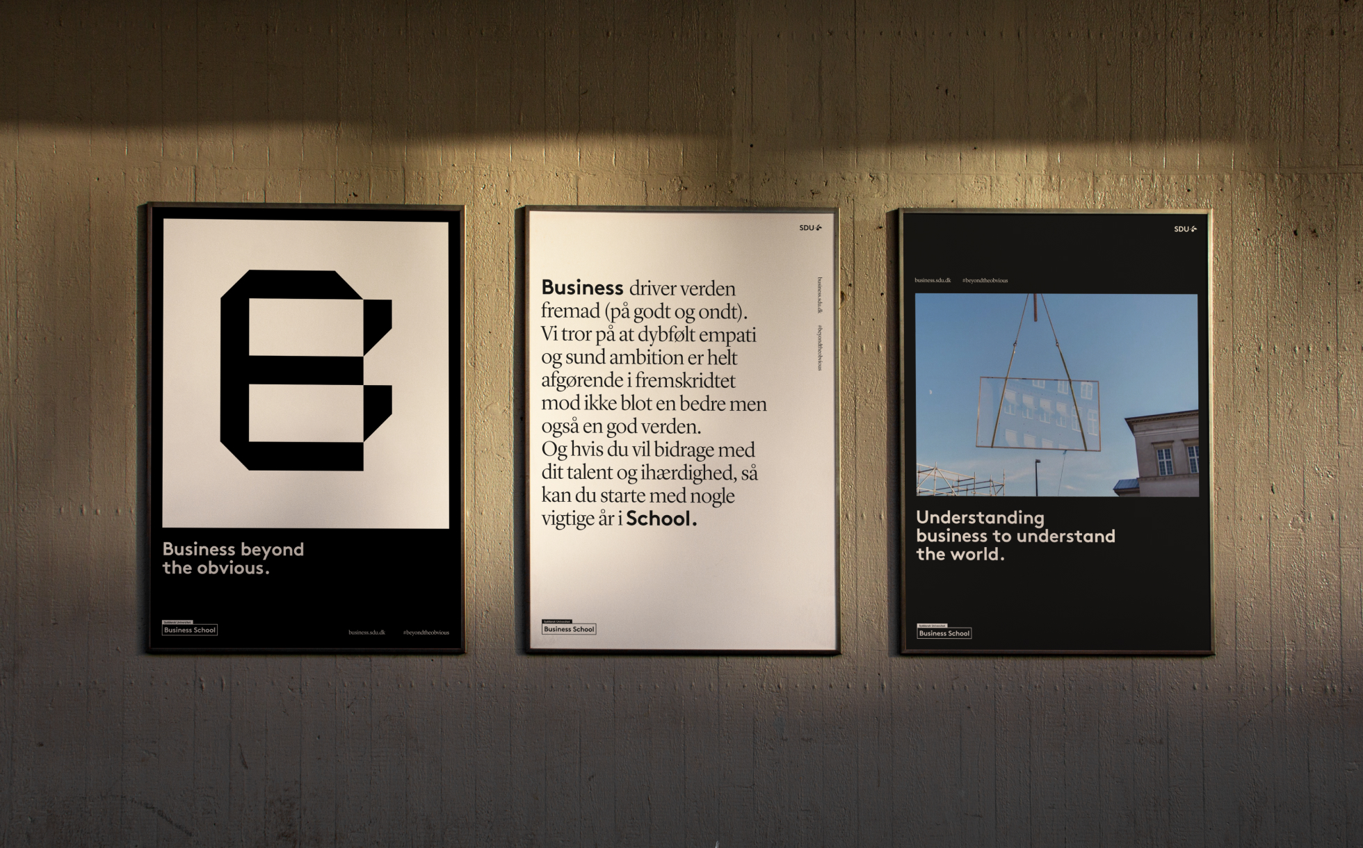
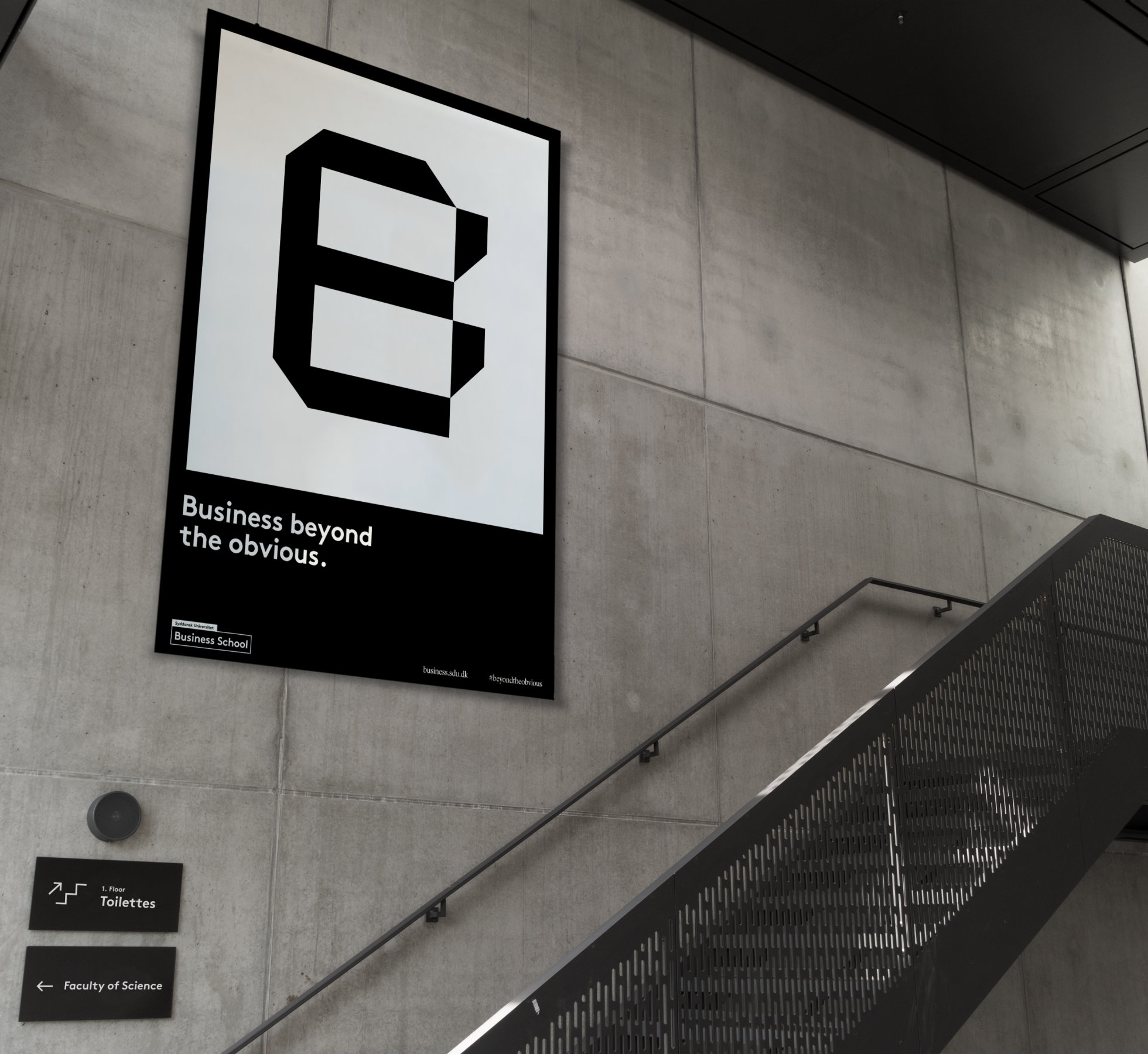
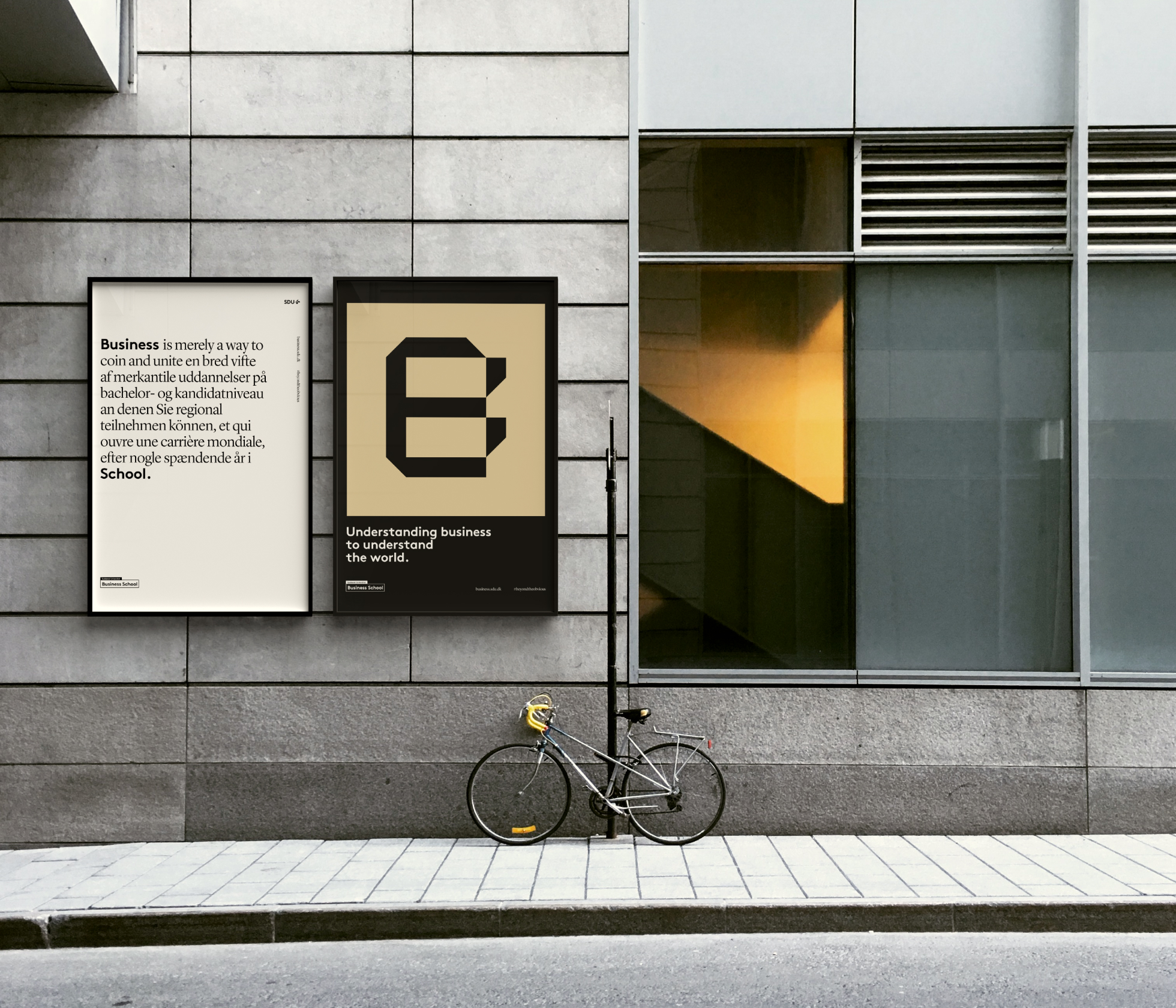
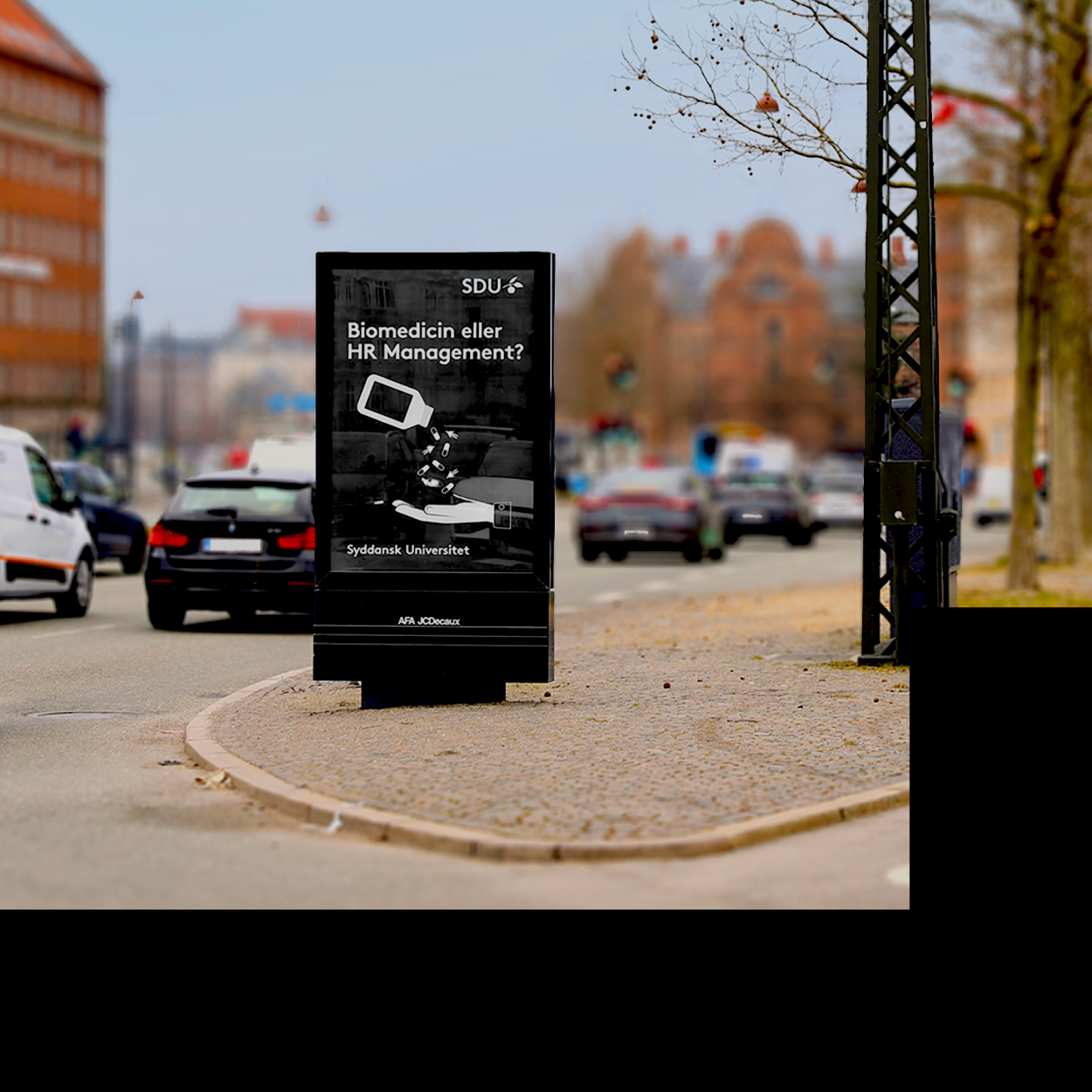
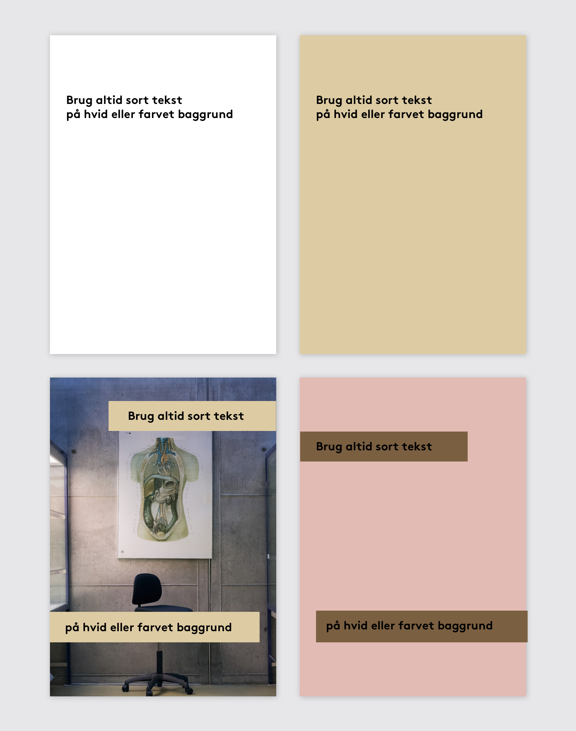
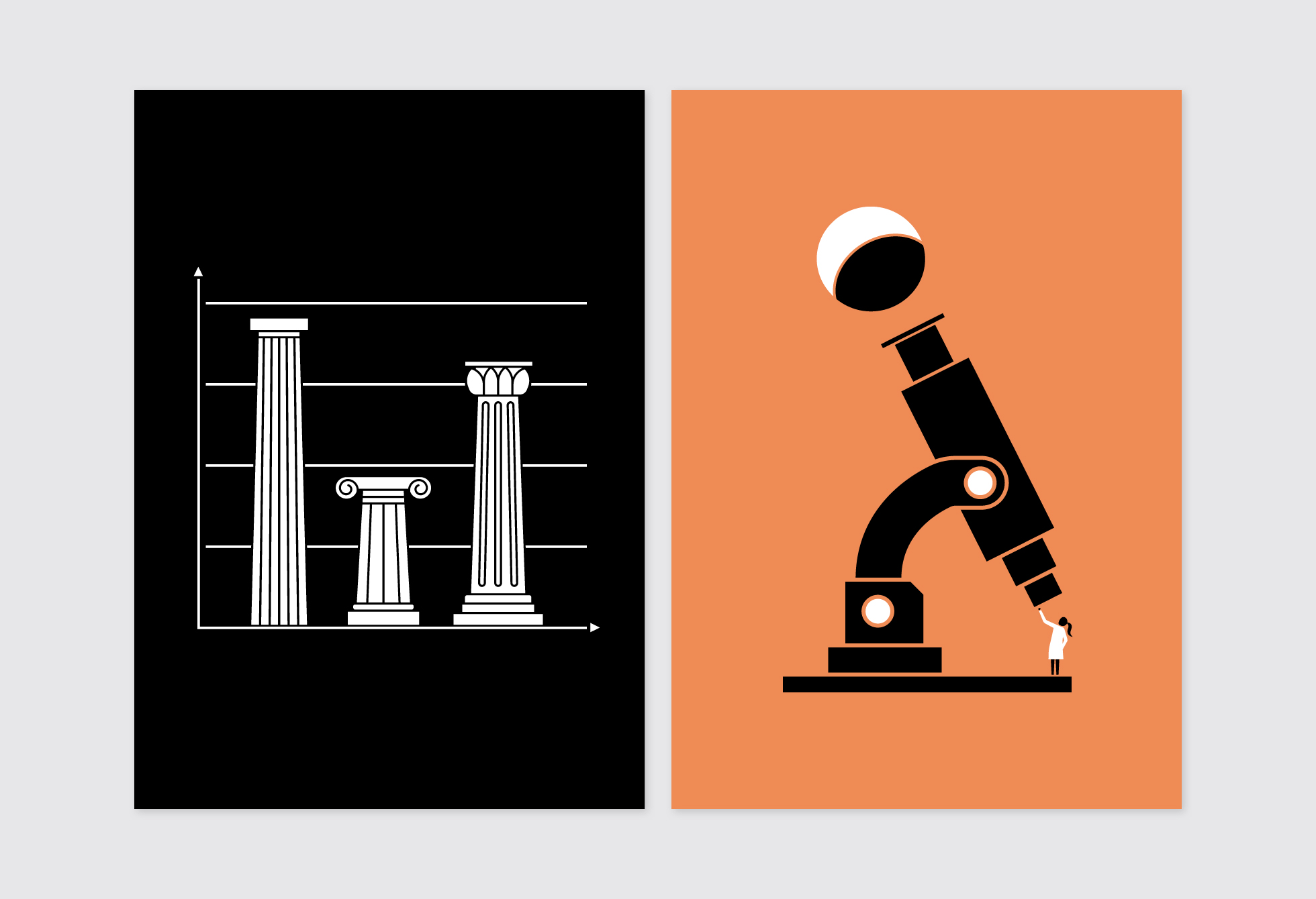
For campaign material use mainly white text and illustrations on black background


The brand platform
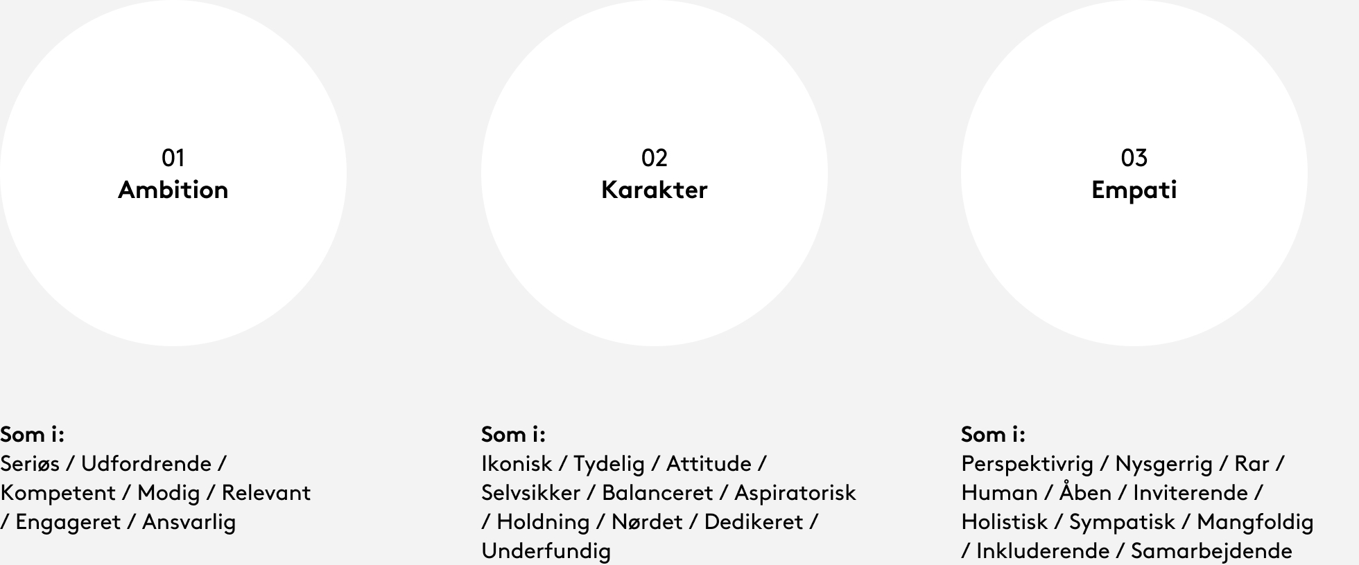
As a part of the development phase, the Communication Department has held a number of workshops with representatives of the management and employees at the faculties and the university as a whole.
On the basis of these workshops, we have succeeded in distilling the values, the tone and style, and the core messages that define SDU. We term these values “spectra”, and they are concentrated expressions of what makes SDU stand out.
They are not to be communicated directly, but serve to chart a direction for how communication and marketing staff, in particular, are to develop communication materials – which tone and style we are to use, and how we present ourselves.
All aspects of this are supported by the design system that has been developed.
Our complex, diverse and changing reality makes us who we are. The five schisms define our value-based extremes and community: The education/education programme/course of study is classical, elitist, virtuous, serious and focused. The organisation is dynamic, sympathetic, challenging, playful and perspective-rich.
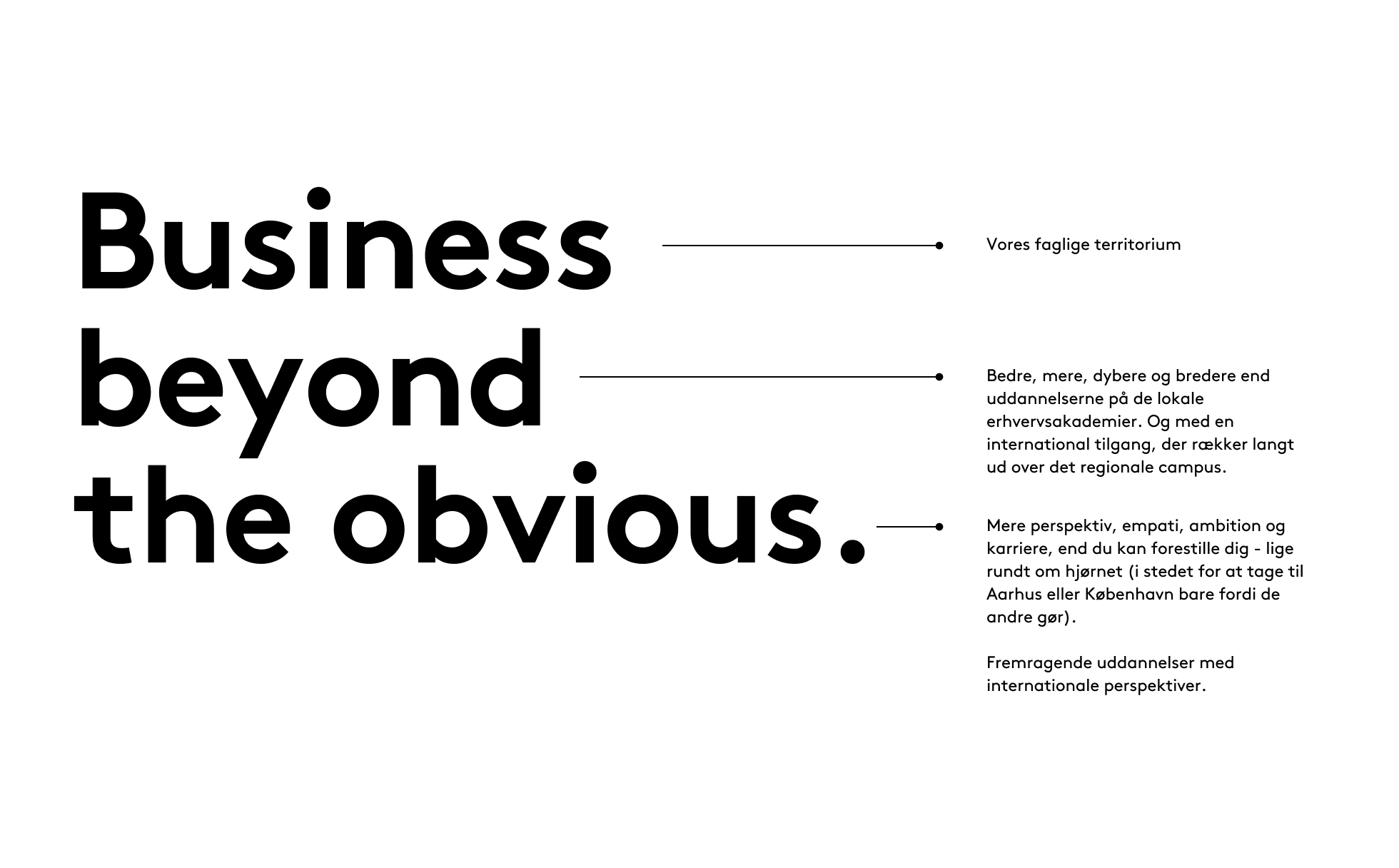
We need to embrace this beautiful complexity in a simple and powerful core - a brand essence that marks our position.
We call this essence Insight & Bite
Insight & Bite
The foundations of SDU lie in societal commitment, high-quality education and ambitious, relevant research. Without our pronounced diligence and insight, we would quite simply not exist. Our constant striving for greater acknowledgement makes us what we are: a university.
At the same time, SDU is something truly special. Our history dates back to a time of upheaval, where altered standards and new demands on our very existence created the agile, responsive university we are today.
We continue to shape and adapt ourselves to match developments in society – inquisitive and keen to experiment. We transcend boundaries, disrupt entrenched thinking, and let new ideas and approaches blossom.
Without our distinctive bite, we will not be here tomorrow.
We combine classic virtues such as education, specialisation and knowledge with dynamic relevance, attentive attitude and sustained enterprise.
Some institutions define themselves on the basis of what they were, and want to continue to be – their name, their heritage, their pride. As if echoes from yesterday can carry them into tomorrow.
We look at the results today and the future we want to influence. We are borne forward by our striving to be a modern, meaningful and relevant knowledge institution. The inquisitive researchers, dedicated staff, the passionate teachers and the large numbers of talented students. Together, they form the backbone of SDU. Yesterday, today and tomorrow.
SDU recognises its elitist position: Celebrates the academic lighthouses and emphasises the deep, nerdy, special, heavy, academic material.
The elitist is a basic premise that is recognised and displayed with justified pride pride. But elitism can become exclusionary and unapproachable. SDU is is not. SDU manages to balance its elitist position and authority with an with an inviting and open approach to its collaboration with local communities, partners and, not least, in its communication with the the broad Danish public.
SDU is rooted in history and has an inherent urge to break new ground. Perhaps even a need to be a bit challenging and different. But everything in moderation.
SDU's research and education/education programme/programme/course of study is of course serious, objective, honest and thorough: SDU is a place you can trust and rely on. - research funding, career and education/education programme/programme/course of study.
But SDU is also characterised by (or sharpened, if you will) the constant need to find new opportunities and relevant positions for research, education/education programme/programme/course of study and organisation. The challenging has therefore become an additional basic premise - something that creates remarkable initiatives.
Welcome to the constant, safe and quiet experiment. Welcome to a university that is built on change.
We are serious and ambitious. All universities are. But few succeed in combining academic gravitas and professional pride with a playful and inquisitive approach.
Research and education are crucial and serious matters – to us, to our students and to our researchers. Our results and our capacity to interact with the outside world, as well as our ability to nurture talent, position us as a key partner in Danish society.
And we’re not here for the stay-at-homes: we are inquisitive, playful and experiment-oriented by nature, and we’re happy to step out onto thin ice. We dare to take focused, carefully considered gambles, with the liberty to try, evaluate and try again.
We cultivate our expertise and results through sustained focus, while our socially relevant knowledge, our attractive position and our strong relations are all developed through innovative contexts.
One of our key purposes is to help talents to bloom and to promote the unique.
Every day, we encounter a host of talented, multi-skilled students and researchers who are driven by different ambitions, but who are all in search of the same thing. We all share a thirst for the deep, focused expertise, for succeeding in an ambition, for pursuing a sense of curiosity, for establishing an attractive set of professional skills.
However, the university staff, the students and the success of researchers cannot rest on their laurels of skills and capabilities. We generate high-profile sustainable value via our constant and relevant perspectivisation across academic disciplines, with an unswerving focus on the society we are part of and want to influence – with our professionalism and diversity.
We have knowledge and attitude, and are quick with a response: intellectual, relevant and readily comprehensible. We dare to speak up, we dare to stimulate debate – but always balanced and with pronounced respect.
We are open, accommodating and respectful in all dialogue. We meet people and partners with equal parts candid presence and appropriate professionalism. We are equal partners, not friends.
We are proud and serious in everything we do and everything we say. We have insight and bite – it is clear to everyone that depth, personality, intention and goodwill lie behind everything we say and everything we do.
We speak and write from the expert perspective, irrespective of function: clipped, clear and concise. We never talk down to anyone. We use everyday language and jargon when it suits the situation, and only come across as elite researchers when this is required and in the right context.
We create value for and with society, and we shape the future through high quality, talented people and excellent environments.
SDU is the third-largest university in Denmark – founded in 1966 and since shaped and powered by a constant need to pinpoint challenging, attractive positions for our research, educational and organisational activities.
Academic expertise is cultivated through sustained focus, while societally relevant skills, capabilities and results are developed through inter-disciplinary and far-reaching relations and partnerships. SDU covers a broad and a deep range in its hunger for expertise and results, its desire to succeed in its ambitions, to pursue its inquisitiveness, and to establish professional and attractive skill sets.
Each and every talented student, ambitious researcher and dedicated member of staff therefore maintains a constant and watchful eye on the society we aim to – and want to – influence with our professionalism and diversity.
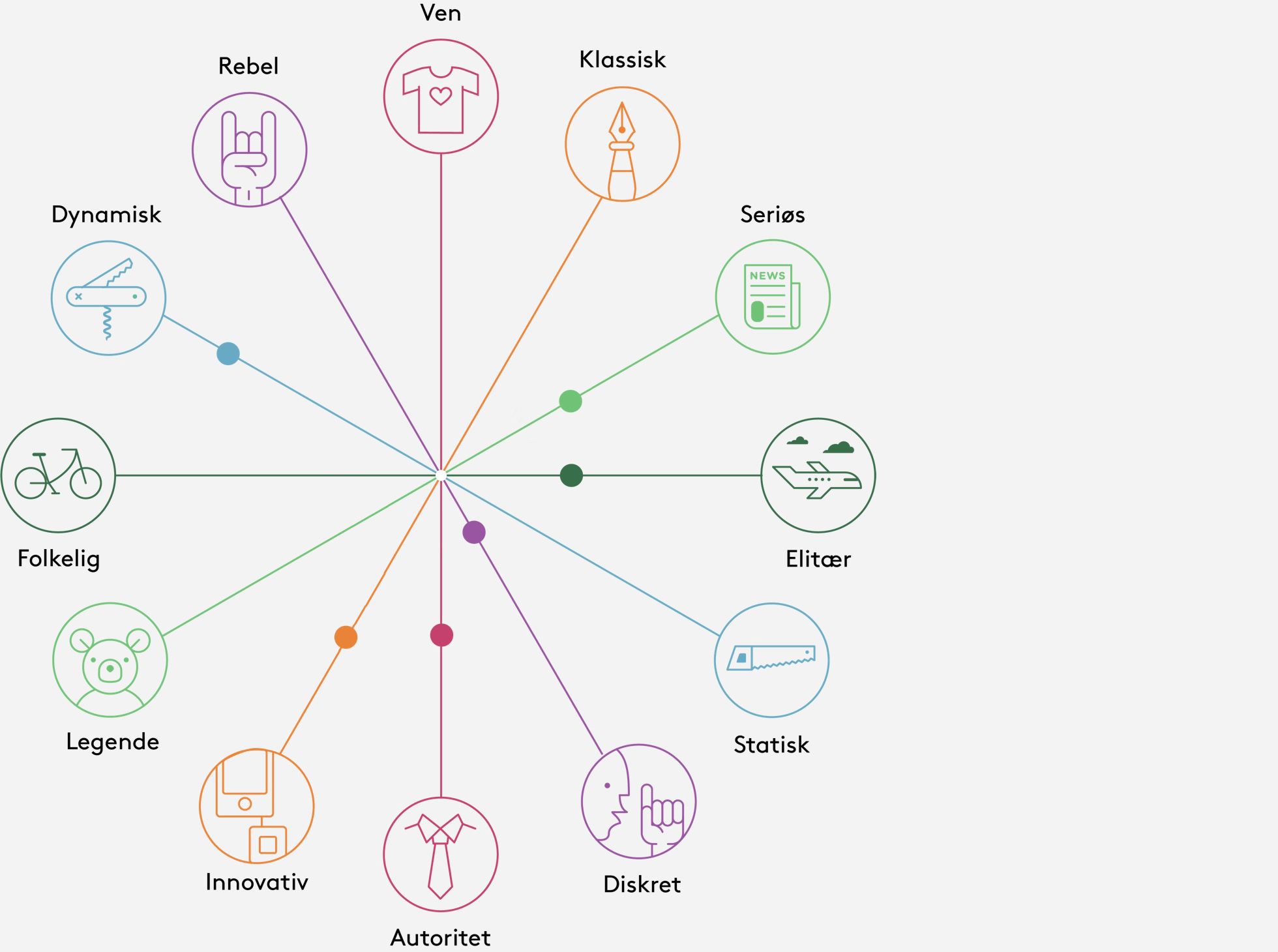
Brand wheel
At each workshop, the distinctive characteristics of SDU were discussed on the basis of a “brand wheel” featuring several pairs of opposite characteristics. The further out the workshop participants placed SDU on each line between a pair of opposites, the more clearly they wanted SDU to communicate that particular characteristic or trait. 7 brand wheels were prepared. The one shown here reflects the inputs and conclusions from workshop 1.